
PWHL Unveils Team Names and Logos for 2024-25 Season
PWHL Unveils Team

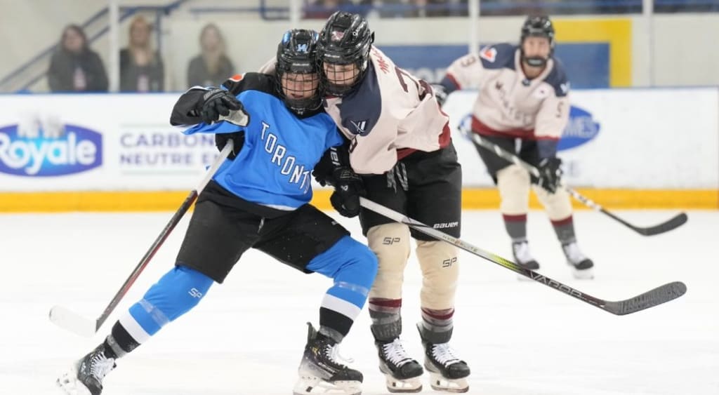
PWHL Unveils Team Names and Logos for 2024-25 Season
The Professional Women’s Hockey League (PWHL) has finally given its six teams unique names and logos as it prepares for its second season. After nearly a year of planning and development, the league made the announcement on CityTV’s Breakfast Television on Monday. With this reveal, the teams are no longer just known by their city names but have taken on distinct identities that reflect their locations and histories.
Meet the Teams
The PWHL’s six franchises now have new, bold identities. There’s the Fleet representing Boston, the Frost taking root in Minnesota, and the Sirens making waves in New York. Meanwhile, in Canada, the Montreal team is now known as Victoire, Ottawa’s team is called Charge, and Toronto is represented by the Sceptres.
The names and logos were long anticipated after the league's inaugural season, which kicked off in January 2024. The teams previously carried the PWHL prefix, like “PWHL Minnesota,” but now, they can fully embrace their new brand identities as they prepare for the second season, starting in early December 2024.
The Process Behind the Names and Logos
Amy Scheer, PWHL’s vice president of business operations, and Kanan Bhatt-Shaw, VP of brand and marketing, were tasked with creating the team names and logos. It wasn’t just about picking catchy names but also finding ones that resonated with each city’s history and culture. They had to balance fan expectations, legal hurdles, and tight timelines to make sure the names were ready for the start of the second season.
“Daunting for sure, but an absolute labor of love,” Scheer said about the project. Despite the challenges, she saw it as an incredible opportunity.
The two spent months sifting through hundreds of potential names. Many were rejected because they couldn’t secure the rights on both sides of the border. After finally narrowing down their options, the PWHL worked with New York-based creative agency Flower Shop to develop the logos. One of the key design choices was to maintain each team’s color scheme from the inaugural season, ensuring that fans who bought merchandise last year wouldn’t feel left out.
The Stories Behind the Names
Each team’s name and logo were carefully chosen to reflect the local culture and history.
Boston Fleet: The Fleet name taps into Boston’s maritime heritage. The logo features a forward-leaning “B” in the shape of an anchor, symbolizing strength and the city’s connection to the sea.
Minnesota Frost: Minnesota’s love for hockey and cold winters is embodied in the Frost name. The sharp icicles in the “F” logo reflect the frigid environment that makes Minnesota the “State of Hockey.”
Montreal Victoire: Paying homage to the team’s French-Canadian roots, the name Victoire represents victory. The logo combines a blue “M” with a fleur-de-lis, a symbol closely tied to Quebec’s identity.
New York Sirens: Inspired by New York’s vibrant cityscape and the siren’s call, the Sirens name also connects to the sound of the goal horn. The logo, featuring angular “NY” letters, mirrors the city’s iconic skyline.
Ottawa Charge: Ottawa’s team name reflects the capital city’s motto, “Advance – Ottawa – En Avant.” The logo incorporates an unfinished letter “O” that doubles as a “C,” symbolizing both Charge and Ottawa.
Toronto Sceptres: The name Sceptres draws from Toronto’s history as the Queen City and its regal past. The logo, featuring a sceptre with the letters “T” and “S,” highlights the city's commanding presence.
Fan Reactions and Future Expectations
The unveiling of the names and logos has sparked excitement, but the league’s executives are prepared for mixed reactions from fans. Scheer acknowledged that there will always be debates, especially in the age of social media, where everyone has an opinion.
“Everybody’s going to sit behind their computers and they’re going to type good, bad, and ugly. And that’s OK,” she said. However, she emphasized that the process was thorough, and they feel confident the new team names are bold, competitive, and representative of their markets.
One particular logo that may stir debate is Boston’s. Some fans pointed out that the Fleet logo, a sideways “B,” could resemble a “W” — potentially reminding fans of the NHL’s former Hartford Whalers. But Scheer was quick to clarify: “That ‘B’ is a sideways anchor and only a sideways anchor.”
Looking Ahead
As the PWHL enters its second season, these new names and logos signal a new era for the league and its teams. Fans now have fresh symbols to rally behind, and the connection between the teams and their communities is stronger than ever. With the league’s next season starting in early December, the countdown is on for players to wear their new logos with pride and represent their cities on the ice.
About the Creator
Sunil Christian
find here all type of news
Keep reading
More stories from Sunil Christian and writers in Gamers and other communities.
Giants vs. Vikings: Game Preview, Key Matchups, and Predictions
Giants vs. Vikings: Game Preview, Key Matchups, and Predictions The highly anticipated game between the New York Giants and the Minnesota Vikings is just around the corner, and it promises to be an exciting matchup. Both teams are looking to gain an edge in a season where every game counts. Here's what to watch for and a few predictions as we break down key matchups and storylines for the game.
By Sunil Christianabout a year ago in Gamers
R6 Predictions for 2026: The Next Chapter of Rainbow Six Siege
In 2026, Rainbow Six Siege won’t feel like a brand-new game and that may be its greatest strength. Instead of chasing trends, Siege is likely to double down on what it already does best: tactical depth, operator-driven gameplay, and a competitive ecosystem that rewards patience and planning. Looking back from this point in time, 2026 could be remembered as the year Siege finally perfected its long-term evolution.
By Deborah Larson4 days ago in Gamers


Comments
There are no comments for this story
Be the first to respond and start the conversation.