
Case study: The legend of Zelda: A link to the past UX/UI redesign
Join me as I apply the UX design process to this retro game

The Legend of Zelda: A Link to the Past was released for the Super NES in Japan in 1991. It is the third game in the Legend of Zelda series and is known for establishing many of the game's classic tropes, such as the Hookshot, the Master Sword, collecting pieces of heart, and the existence of two parallel worlds. While the game is a cult classic, the UI is basic, unintuitive, and does not hold up to today's standards.
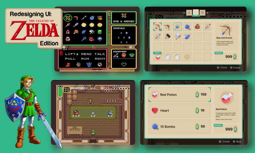
In this case study, I've given this classic a UX/UI upgrade for today's gamer who enjoys a vintage play-through. I've redesigned the UX and UI for three screens- the overworld, the inventory, and the shop.
Stage 1: Research
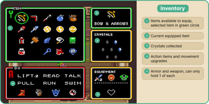
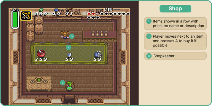
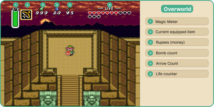
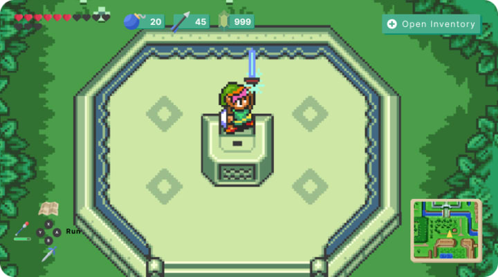
I analyzed and broke down all features and UI for 3 frequently used screens - the inventory, the shop, and the overworld, or your main view when you are playing. Many icons are unclear, the buttons to complete an action are not stated, and the inventory could use organization.
User-Testing
I put together a series of tasks to complete in the game that would require the testers to interact with all the UI screens. I conducted two moderated in-person tests. I purposefully found people of difference experience levels, and asked them to play the original game on the Nintendo Switch and complete each task. I asked them how they were feeling throughout the playthrough, which parts were frustrating, which were easy, and if they wish something was different. The test subjects needed to complete these 5 tasks:
1. Identify what all the UI elements on the main screen are
2. Attack an enemy
3. Open the inventory
4. Equip an item
5. Buy something from a shop
Tester #1
An experienced gamer. He has not played this game before but has played other Zelda games.
1. From left to right - "A green bar, no idea. Then the weapon I am using, money, bombs, arrows, life remaining, the red hearts are how many i have left. Once i used a magic item i understand the green bar is magic power, maybe it should only show when i have a magic item equipped?
2. "I didn't realize I still had my sword equipped, I thought it was just arrows. I think the bow is a special item and my sword is always the main attack." Defeated the enemy with sword.
3. "It took me a while to figure out how to open the menu. I pressed every other button before pressing the plus button on my switch"
4. "There should be maybe a sound or a frame around which item is equipped. I didn't know what was equipped otherwise.."
5. "The shop was easy enough to understand, the prices are there next to the items, but when I select an item it doesn't tell me what it is. I bought a medicine without knowing what it is. I wish they would ask if I wanted it first without just buying it."
Tester #2
An inexperienced gamer. She has not played this game before.
1. She didn't know what the green bar was. "It says ½. Maybe it's 1 out of 2 tries. Then there is a bow and arrow, maybe it's the weapon I am holding. The next are what i have in supply, 999 crystals, 20 ore, and 45 throwing hammers. The one on the right is my life counter, how much strength I have."
2. She killed the enemy easily.
3. She first opened the map, then cycled through all the attacks. It took 15 seconds to open the inventory. She understood that it shows what items she has. Thinks you push "A" to equip an item. Knew that the bottom section was actions.
4. "Doesn't seem intuitive to use an item. Eventually I figured it out but it should tell you that an item is equipped." She didn't know the boomerang was equipped until she closed the menu. She wanted to use the potion in the inventory system, she didn't realize it needed to be equipped first.
5. "The shop was easy." She bought an item easily. But she thinks it would be nice to know what the items are first.
Competitive Analysis
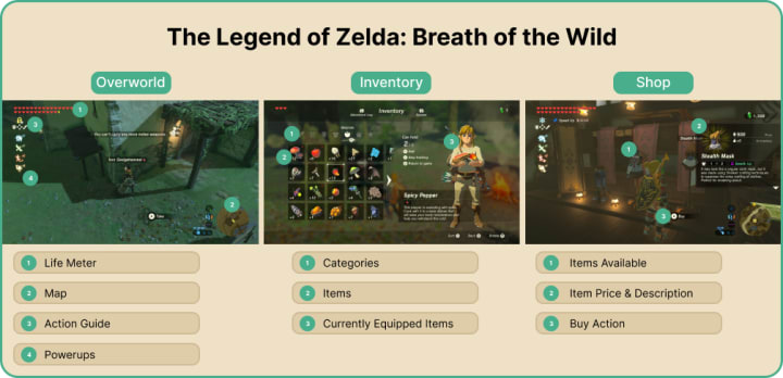
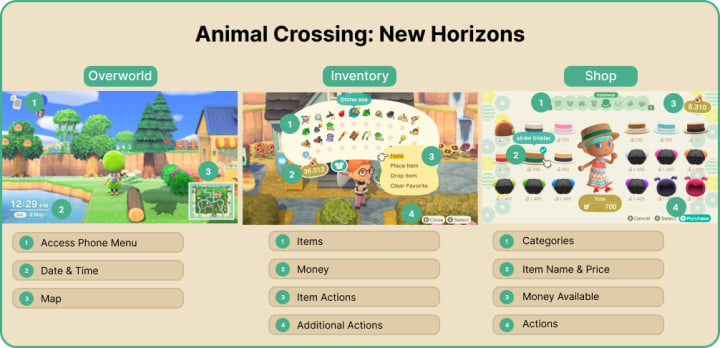
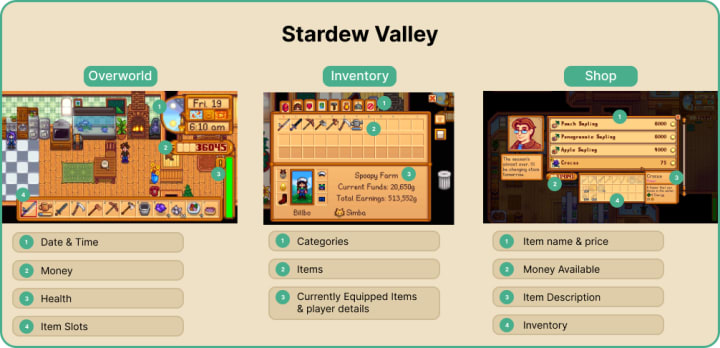
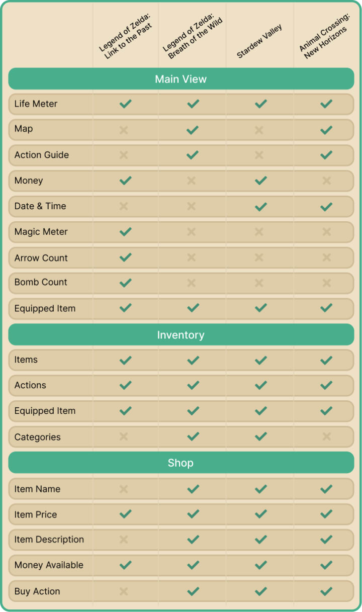
I looked at the same 3 screens with 3 games that have notably good UI and inventory management - The Legend of Zelda: Breath of the Wild, Animal Crossing: New Horizons, and Stardew Valley. I analyzed how they tackled each feature and what they chose to display. Then I compiled all the features across all the games and organized them into a feature matrix.
Stage 2: Define
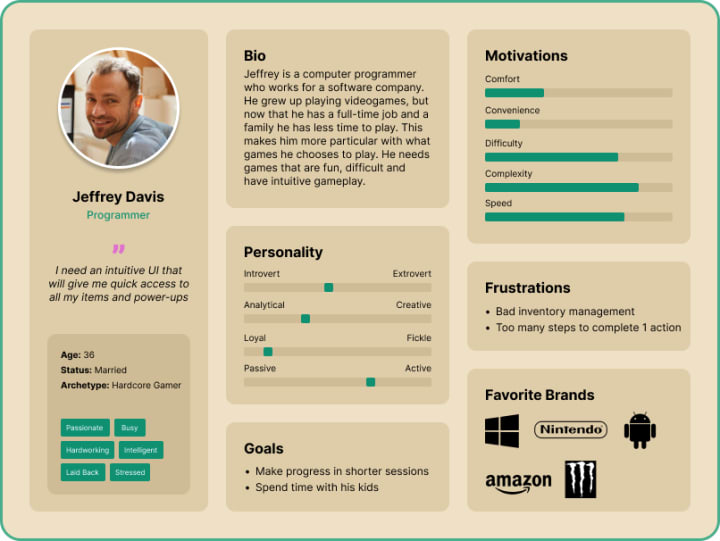
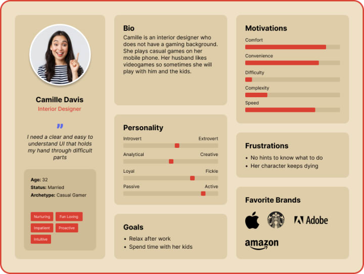
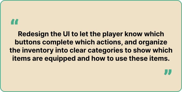
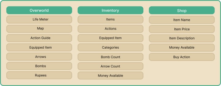
I created two personas to understand users' motivations. One persona is for an experienced gamer who needs easy access to everything, and an inexperienced gamer who needs clear instructions on what to do. I also made a POV statement, which is my purpose of redesign, and put together a feature matrix of all planned faetures on each screen.
Stage 3: Design
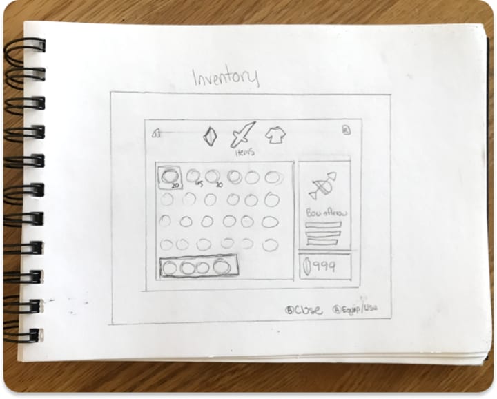
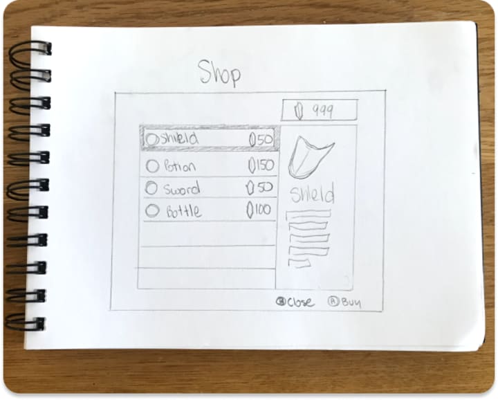
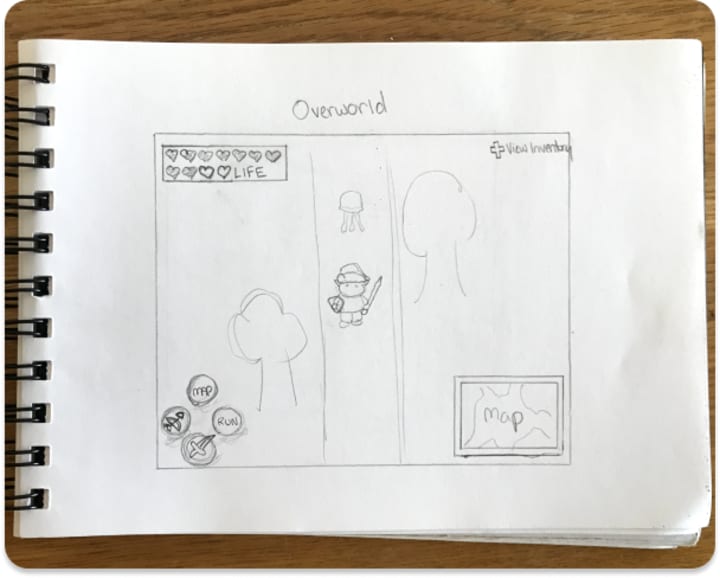
I sketched out my ideas in my sketchbook to get a rough idea of how each screen would look.
I then took to Figma to create the basic wireframes for how the digital screens would look. This gave me a better idea of the spatial composition for the final UI.
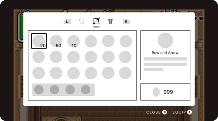
I was finally ready for the final UI. I chose a neutral color palette with the highlight color a sage green, to match link's tunic. I added categories to the inventory, to make it more organized, and made sure the actions were clearly labeled so even the most novice player could understand.
Stage 4: Test
User Testing
I conducted two more moderated in-person tests with my new UI screens. Since this is not a playable game, I came up with new questions to ask related to the intuitiveness of the screens. I asked them these 6 questions while showing them each screen:
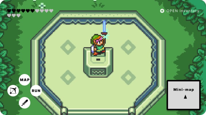
1. What does each symbol mean on the overworld screen?
2. What button would you press to attack an enemy?
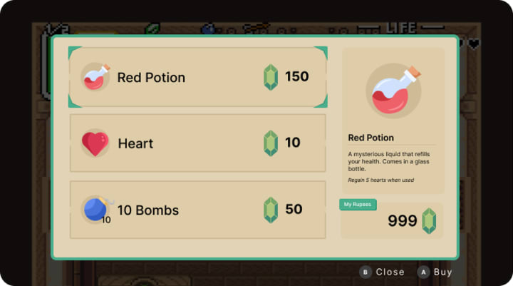
3. How would you buy an item in the shop?
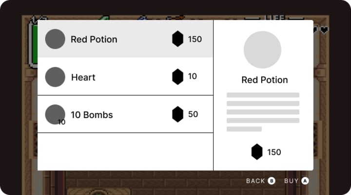
4. How much does the red potion cost?
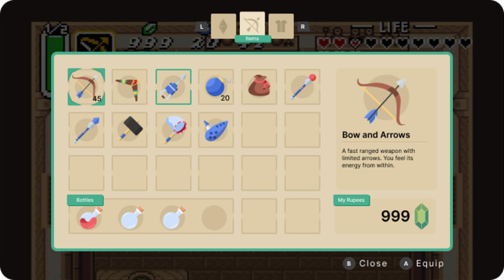
5. How would you cycle through the categories in the inventory?
6. How would you equip an item in the inventory?
Tester #1
Tester #1 is an experienced gamer that is familiar with video game mechanics and game UI.
1. "It looks like my life, the number of arrows, number of bombs, and money on the left. Then it tells me which button to press to open my inventory. Below that it gives an action guide for the main buttons. on the bottom right is a mini-map.
2. "I would press A to use the sword." He came up with this answer immediately.
3. "I would press B. That is very clear"
4. "150 rupees"
5. "I would press the left and right buttons no my controller"
6. "Press A"
Tester #2
Tester #2 is an inexperienced gamer that is not familiar with video game mechanics or game UI.
1. "How many I have of each Bombs, arrows, jewels to buy stuff. on the bottom left it shows me what my buttons do. Y shows me my magic level. The bottom right must be the local map."
2. "I would press B"
3. "I would push A because it says buy."
4. "150." She said it very quickly.
5. "The left and right buttons on my controller. Items versus clothing versus gems."
6. "I push A."
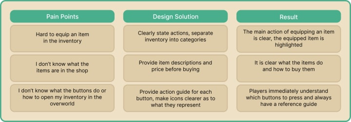
After the final interviews with my testers I compiled the data into an affinity map and included user pain points, my solutions, and the results.
About the Creator
Victoria Kaufman
UX/UI Game Designer. Portfolio Link: www.victoriakaufman.com
Keep reading
More stories from writers in Gamers and other communities.
Palworld TCG Guide: Release Date, How to Play, and Bushiroad Card List
The survival gaming world was recently rocked by an announcement that many saw coming but few expected to be this ambitious. Pocketpair has officially pulled back the curtain on the Palworld Trading Card Game, a physical tabletop experience developed in partnership with the industry giants at Bushiroad.
By Richard Bailey2 days ago in Gamers
From Stories to Systems
For a long time, this space has been a bit… quiet. If you’ve stumbled across this blog before, you might have seen short stories, poems, or bits of fiction—creative experiments written at different points in my life. That part of me hasn’t disappeared. I still love storytelling, world-building, and exploring ideas through narrative.
By D. E. King3 days ago in Gamers
The Devil's Cut
“Comrade, finally you’re awake.” The voice was smooth, sensual. A flickering incandescent bar was all that lit the white, sterile room. All Vladimir remembered was everything going black. He tried to move his arms and found them strapped to the gurney.
By Matthew J. Fromm4 days ago in Fiction


Comments
There are no comments for this story
Be the first to respond and start the conversation.