
DATA VISUALIZATION ON STEROIDS
I love data visualization. There are few things more exciting than trying to create something beautiful that shows off data clearly.


Data visualization is widely used in Business Intelligence, CRM, and Marketing. It is a key mechanism for communicating information in a way that the user can understand. If you're not using data visualization techniques on your website, then you are losing clients to your competitors that are.
SIMPLIFY AND DESCRIBE DATA INTERPRETATION
Data visualization can help describe and simplify data interpretation. It presents information in a visual way that is more appealing for people to study and make business decisions. Data visualization is not just a trend; it's really an effective and powerful way to communicate data to the public and to other specialists.
For form to follow function, you need to think about who will use it and how they will use it. If the data helps everyone, then make it available for everyone. If it only helps a specific group or is used by a specific group, then make sure it's presented in a way that those members can easily get the information and use it effectively.
Logical structure. This is the most difficult one! How will you introduce the data? What facts do you want to make sure the reader knows before diving into the rest of your story?
The era of the cog in a wheel is over.
We are living in a time where employees are empowered to make decisions and no longer just execute orders. Data must be presented on the terms that your audience needs it. It must guide them toward the actions you want them to take.
Data is like a river; it always flows downstream to the place where it can make the greatest impact. Identify that place, and build your interface around it.
"If you were selling me this information, how would you persuade me that it was worth my time and attention?" This is the question you should be asking as you design a dashboard. You need to understand that when information is presented to someone, they are in control of their attention. If they don't want to pay attention to a part of the dashboard, nothing will force them to do so. Design your data visualization with this in mind. We call this focus, and it's one of the reasons why small multiples work so well. The viewer can get their bearings fast because they aren't lost among too many details at one time.
CLEAR, CONCISE AND APPEALING
Data visualization is a vital part of analyzing, representing, and presenting data with the purpose of accomplishing a goal or task. It helps us view and understand the data more easily. We can see a broad data set as a whole, get a better picture of it, and then zero in on the specific details.
Good visualizations are clear, concise, and appealing. They communicate the essential details of data in an easy-to-follow manner that an audience can quickly grasp and use to draw actionable conclusions. While vague or unclear information might leave some people wondering what is actually being said, or perhaps cause them to tune out entirely, a well-designed visualization will have the opposite effect. Instead of getting bogged down in boring statistics and unnecessary facts, viewers will be drawn to the visuals and find them much easier to absorb. Good visualizations also allow audiences to see patterns they might otherwise miss.
TELL THE WHOLE STORY
Telling your story with data is as much about the visualization as it is the data. Visualizing data sets can be difficult. They often involve large datasets and contain relationships between many variables in more than the two dimensions that most people are accustomed to thinking about.
It is crucial to not only tell your company's story with data but also to explore the story of your data. Visualizations are a great way to do this; they prepare you for understanding and discussion by providing a framework for how your data is represented. Visualizing your data can help people understand it better.
When working with large data sets, the data itself is only part of the story. We get a lot of questions from people about how to tell their data's story - some much larger than others. Visualizing and presenting data is so important it's almost a necessary skill before you can analyze your data in any meaningful way, so they're worth investing in. The right visualization can provide that 'Aha!' moment or crucial insight you're looking for.
"There are two goals when presenting data: convey your story and establish credibility." - Edward Tufte
Here are some tips for getting started:
Know What You Want To Say
Well, before you get into the details of how to design a cool-looking chart or graph, it's important for you to know what message this visualization is going to communicate. Before you do anything else, ask yourself: What do I want this chart to say?
Once you know that, it'll be easier for you to decide which visualization will work best for your needs. And when it comes to data visualizations, there are a lot of options.
Think about the user of your visualized data
The most important thing to understand about data visualization is that it isn't just about creating pretty charts and graphs. It's about giving purpose to the data by making it easy to understand. The user wants actionable insights, not just pretty charts.
You can easily lose sight of the user, so keep them in mind from start to finish. Start with the questions you want to answer, then figure out how you'll collect the data. Remember: collecting data for its own sake is a waste of time and resources. If you don't need it to make a decision or solve a problem, don't collect it. Once you have your data and decide what you want to visualize, think about how best to show your findings so that viewers grasp your message instantly - and in a way that's easy for them to absorb.
When you're creating data visualization, it's important to think about your audience.
- What do they want to know?
- Who are they?
- How much do they care about this data?
- What are they using it for?
These questions will help you understand the purpose of your visualization and what it needs to accomplish. If your user wants actionable insights from your data, then you'll need to make sure that each element of your graph or chart is informative on its own.
Let's say you're analyzing some data on sales and creating a graph to show your boss how sales have changed over time. The goal is to explain what's happening with sales - are they increasing? Decreasing? Why? What does that mean for your company? What are the implications for future business decisions? What should you do about it now?
But if your chart is confusing or hard to look at, the user isn't going to be able to use that information effectively. They'll spend more time trying to decipher what the graph means than actually thinking about what it means for their business!
Keep it simple
Data visualization is all about simplicity. The simpler you can make the design of the chart, the easier it will be for users to read and understand what you're trying to convey.
Once you've got a handle on who your audience is, you're ready to start thinking visually. How will your data be most easily understood? A chart? A graph? How many dimensions will it show? Will it use colour effectively? How can you make use of composition and space? Before you even get into what type of visualization tool you'll use, ask yourself - what is the best way to visualize this data so that your audience understands it quickly and easily?
DATA VISUALIZATION TOOLS:
The best data visualization tools include Microsoft Excel (and Power BI), Google Charts, Tableau, Grafana, Chartist.js, FusionCharts, Datawrapper, Infogram, ChartBlocks, and D3.js. The best tools offer a variety of visualization styles, are easy to use, and can handle large data sets.
About the Creator
Edison Ade
I Write about Startup Growth. Helping visionary founders scale with proven systems & strategies. Author of books on hypergrowth, AI + the future.
I do a lot of Spoken Word/Poetry, Love Reviewing Movies.
Reader insights
Outstanding
Excellent work. Looking forward to reading more!
Top insight
Expert insights and opinions
Arguments were carefully researched and presented
Keep reading
More stories from Edison Ade and writers in Futurism and other communities.
You should see the Netflix Series “Snowpiercer”.
The climactic action sequences in Snowpiercer are among the most viscerally exciting I've ever seen. However, this film's intriguing, layered world and characters prove far more memorable long after we leave the theatre, and that's ultimately what makes it special. Based on a graphic novel by Jacque Lob, Jean-Marc Rochette and Benjamin Legrand and South Korean director Bong Joon Ho's first English-language feature, Snowpiercer is set in a post-apocalyptic world where humanity has fled to the train of a perpetually moving super train that travels around the planet as the ice caps have melted into oblivion. Passengers live in extreme class segregation inside of cars divided by poverty.
By Edison Ade4 years ago in Futurism
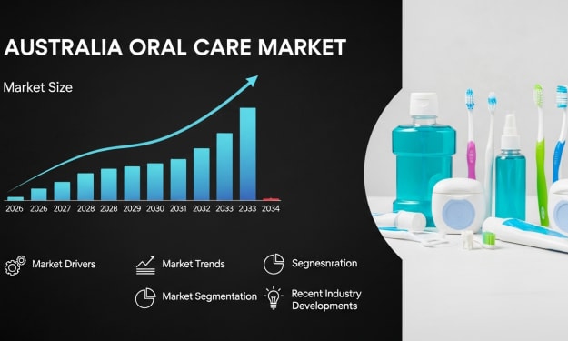
Australia Oral Care Market: Preventive Hygiene, Consumer Awareness & Product Innovation
According to IMARC Group, the Australia oral care market reached USD 1.1 Billion in 2025 and is projected to grow to USD 2.3 Billion by 2034, exhibiting a compound annual growth rate (CAGR) of 7.74% during 2026–2034. The market’s rapid expansion reflects rising awareness of oral hygiene and its connection to overall wellness across Australia. Consumers are increasingly investing in preventive dental care, advanced hygiene tools, and cosmetic oral products. Technological innovations such as electric and smart toothbrushes, along with demand for natural and eco-friendly solutions, are reshaping product portfolios and strengthening Australia oral care market share.
By Kevin Cooper4 days ago in Futurism
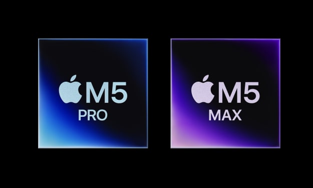
The Fusion Shift: 5 Game-Changing Secrets Behind Apple’s M5 Pro and M5 Max
1. Introduction: The Death of the Pro-User Bottleneck For years, the professional workflow has been a negotiation with the laws of physics. We have lived with thermal ceilings that throttle our 4K exports and the frustrating stutter of memory swapping during heavy 3D renders. Even the transition to Apple Silicon, as transformative as it was, eventually hit the limits of traditional monolithic chip design.
By Tech Horizonsabout 14 hours ago in Futurism


Comments
There are no comments for this story
Be the first to respond and start the conversation.