
9 Essential Pixel Fonts Every Gamer and Content Creator Should Know
A must have font kit for youtubers and game developers


As someone who's spent countless hours tweaking thumbnails and agonizing over game UI design, I've learned that the right font can make or break your visual identity. Pixel fonts in particular hold a special place in gaming culture - they're not just nostalgic throwbacks, but practical tools that can give your content that perfect retro-modern edge.
After years of experimenting (and yes, making some questionable font choices along the way), I've narrowed down my absolute favorites. Here are 9 pixel fonts that deserve a place in every gamer, YouTuber, and game developer's toolkit.
1. Chonky Bits: The Bold Statement Maker
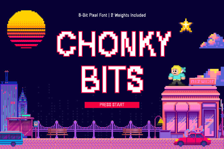
I discovered Chonky Bits while desperately searching for something that wouldn't disappear in my YouTube thumbnails, and it was love at first sight. This font means business with its thick, blocky character that practically jumps off the screen.
What makes Chonky Bits special is how it balances that bold pixelated charm without sacrificing readability. I've used it for game title screens, stream overlays, and anywhere I need text that commands attention without looking like I'm trying too hard. It's become my go-to for projects where I need that perfect blend of retro gaming aesthetics and modern visibility.
2. Stamp Press: The Character-Filled Classic

Though technically more of a typewriter font than pure pixel art, Stamp Press has earned its place in my regular rotation. It delivers that slightly imperfect, mechanical feel that works beautifully for dialogue boxes and narrative elements.
What I love most about Stamp Press is how it adds personality to text without overwhelming the design. Its uniform character width makes formatting a breeze, and those slightly distressed edges give everything a handcrafted feel that's increasingly rare in our ultra-polished digital world. It's my secret weapon when I want something that feels both nostalgic and refreshingly authentic.
3. Press Start 2P: Pure Arcade Nostalgia

When I need to transport viewers straight back to the arcade era, Press Start 2P is unmatched. This font perfectly captures that classic 8-bit console typography that defined gaming's golden age.
I've found it works beautifully for headers and UI elements, especially in projects where you want to evoke that quarter-munching arcade cabinet feeling. Yes, it takes up more horizontal space than most fonts, but that's part of its charm – it commands attention and comes packed with instant recognition value. Just seeing it takes me back to those late nights at the arcade, which is exactly the feeling I often want to capture.
4. VCR OSD Mono: The Retro-Tech Champion

The first time I used VCR OSD Mono in a project, viewers immediately commented on the "cool 80s vibe" it brought. This monospaced font recreates the look of text from old VCR displays and early computer terminals with remarkable accuracy.
What makes this font particularly versatile is how it bridges multiple nostalgic aesthetics – it works for cyberpunk themes, horror games (think security camera footage), and vaporwave aesthetics. I've used it for stream overlays during retro gaming sessions, and it perfectly complements the pixelated graphics while maintaining excellent readability.
5. Minecraft Font: Instant Recognition

Sometimes you want a font that connects immediately with your audience, and few do that better than fonts inspired by Minecraft's iconic typography. Whether you're creating content about the game itself or just want to tap into that blocky, sandbox aesthetic, this font family offers instant recognition.
I've found it particularly effective for younger audiences who might not connect with the older arcade-style fonts. It's become visual shorthand for creativity, exploration, and user-generated content – all powerful associations for any gaming project.
6. Bit Potion: RPG Perfection

For anyone creating fantasy gaming content, Bit Potion is an absolute treasure. This font captures the essence of 16-bit RPG text systems – think Final Fantasy, Chrono Trigger, and other classic role-playing experiences.
What I appreciate most about Bit Potion is its versatility within the fantasy genre. I've used it for everything from dialog systems to menu interfaces, and it always brings that perfect touch of adventure. The extended character set is particularly valuable when your narrative needs special symbols or accents.
7. Nokia Cellphone FC: Y2K Nostalgia
There's something undeniably charming about this recreation of the classic Nokia phone font. For millennials like me, it immediately triggers memories of playing Snake and sending those early text messages.
I've found this font works wonderfully for mobile game interfaces, particularly when space is limited but readability can't be compromised. It's also become increasingly popular for projects aiming for that turn-of-the-millennium aesthetic. When I used it in a stream overlay package, viewers immediately commented on the nostalgia factor.
8. Silkscreen: Clean Minimalism
Not every project calls for heavy retro vibes. Sometimes you need a pixel font that brings just a touch of that digital aesthetic while maintaining a clean, modern approach. That's where Silkscreen shines.
I've relied on Silkscreen for projects where readability and a subtle gaming connection are priorities. Its simplified forms and excellent spacing make it ideal for UI elements, menus, and situations where you need text to be instantly scannable. It's become my pick for more professional gaming applications where the "loud" retro fonts might feel out of place.
9. 04b_03: Compact Excellence
Rounding out my list is 04b_03, a tiny powerhouse of a font. When screen real estate is precious – like on mobile devices or crowded status displays – this ultra-compact pixel font delivers remarkable readability despite its small footprint.
I discovered this gem when designing a mobile game interface where every pixel mattered. Despite its small size, it maintains character and visual clarity that surpasses many alternatives. It's become my solution for scoring systems, status indicators, and other interface elements where space efficiency is crucial.
A Font For Every Gaming Story
Your choice of typography tells part of your story before a single word is read. Whether you're creating videos, designing games, or building a streaming brand, the right pixel font can instantly communicate your aesthetic and connect with your audience on a deeper level.
I've found that having a diverse collection of these fonts allows me to match the perfect typography to each project's unique needs. From the bold punch of Chonky Bits to the space-efficient design of 04b_03, each brings something special to the table.
What's your go-to pixel font? Have you discovered any hidden gems that deserve more recognition? I'd love to hear about your favorites in the comments!
About the Creator
Syed Faraz Ahmad
I'm a tech writer who loves futuristic themes and animals. I enjoy sharing simple, interesting content on tech trends, future designs, and animal stories—keeping it fun and easy for readers to connect with.
Keep reading
More stories from Syed Faraz Ahmad and writers in Futurism and other communities.
How to Create Awesome Instagram and Twitter Bios
Want your social profiles to stand out? You're in the right place! Creating a great bio doesn't have to be complicated. With a few simple tricks and the right tools, you can make a bio that shows who you really are.
By Syed Faraz Ahmad11 months ago in Lifehack
Solar and Battery Storage in NSW: The Complete Guide for Homeowners in 2026
Solar energy is becoming an essential part of the energy mix in Australia, and understanding how solar production peaks throughout the day can help you make the most of its benefits. Solar panels are most efficient during certain periods of the day, and knowing when these peak times occur allows you to optimise your system for maximum energy savings.
By SolarLover4 days ago in Futurism
Custom Data-driven Platforms for Business Decision-making and Visualization
The explosion of enterprise data not necessary translates into better business decisions. In practice, many companies now have sprawling data lakes, warehouses, and even AI/ML pipelines, but struggle to turn that data into action. Data by itself has limited value unless users can understand it and act on it. The real bottleneck isn’t the data or even the AI models, but the way people interact with them. This article explores how custom data-driven platforms can bridge the gap between raw data and confident decision-making.
By Sergey Laptick4 days ago in Futurism
The Politics of Playing Dress-Up
Well, to start off I'd like to say a happy world book day to all who celebrate. I know I haven't really posted anything on my socials about it but I'm not a jubilant kind of person. I lay low most of the time. Let's start off with a popular anecdote from the vaults...
By Annie Kapur3 days ago in Geeks


Comments
There are no comments for this story
Be the first to respond and start the conversation.