
Tips For Creating Website Icons: What Every Designer Should Know
ICONS! We all are totally dependent on them.

From turning on your computer to browsing around and arriving at this page, everything was accomplished by clicking on various icons. Every icon indicates the overall value of the system, which cannot be ignored, making it an essential component of web design. Through the icon, a user may simply understand a computer or mobile operation. It's also simple to recall.
Consider the last time you opened Facebook. On the navigation button, every icon is replaced with a long text. The majority of the time will be spent unable to understand what is displayed on the screen. By now it is clear that designing without icons is not possible. In this article, I'll discuss a few things to think about while developing icons for your website, particularly if you're a designer.
A decent icon may be utilized for applications, social media, and even small printed projects such as business cards. And all it takes is just a little design and preparation.
Difference between a logo and an icon?
Let's clear up a few things before we go into what to observe while making icons. Do you believe that logos and icons are replaceable? This begs the question of what an icon is and how to tell it apart from a logo. It's important to understand the difference between logos and icons. If you look about, you'll notice icons everywhere, but for now, let's focus on those in the digital realm.
A logo is something that represents the entire business or organization. Icons are the visual representations of a company's or organization's content. Icons are visual representations of your notion, idea, or activity.
Almost all icons are made in quadrants and scaled to certain dimensions. This helps them to stay inside the square App icon dimensions and/or give consistency when creating website activities. They're usually little.
Before creating website icons, keep the following points in mind:
1. Make it simple to read:
The icon should have a graphic that is easily recognized due to branding or because it is simple to grasp. Consider the icons on your computer's desktop. Because of the simplicity of icons, you know where things are - papers are saved in folders, songs are played from a button shaped like a musical note, and photographs are stored in a place that resembles a Polaroid snapshot.
When it comes to graphic legibility, branding is an important factor to consider. Icons are frequently used as part of a logo or an iconic picture for large and well-known brands. Even in small sizes, people tend to notice these components right away. This can be more difficult for new or smaller companies or icon concepts and designers may choose to use different strategies for maximum effect.
2. Create in a Vector Format:
The format is also important to consider when it comes to scale and size. A vector-based design is required while making an icon. With a vector image, you'll be able to make adjustments and save the icon for a range of devices, sizes, and viewports without having to create a large number of separate pictures.
You'll need many versions of an icon in different sizes for various tasks. Vector has the advantage of being flexible. But, there is a limit. You'll probably want to save a copy in a non-vector version for many apps or systems.
3. Avoid words:
Words are not used in icons. There is just not enough place for an icon with that much information to read and interpret. As a general guideline, don't use text unless it's part of your logo. Even elements of a logo's text should be carefully studied before being used in the main logo design. The icon should be created in such a manner that it conveys identification without the need for words.
Also, keep in mind how many icons are really utilized in relation to the devices on which they show. Somewhere under the actual icon block, most contain a line of description text. For example, the Design Shack icon is a single letter "d" with color and font treatments that are consistent with the website. Without saying anything, the uniform logo and easy-to-read letter provide a visual relationship and connection.
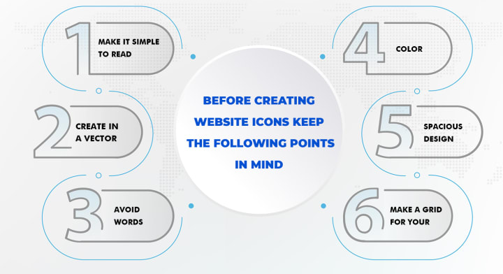
4. Color:
Color may help your icons maintain consistency with your brand while also drawing attention to the important actions or features for your users. Color may assist consumers to navigate the site easier by having a different color indicator for an active state. When an icon contains more than one color, it may be difficult to read.
Each icon on a website does not need to have a different color. Icons are not logos, as I earlier mentioned, but their primary goal is to communicate a concept in a short and straightforward manner rather than deceive customers about where to click. Make sure you only use one color that has been allowed by the website's owner.
5. Spacious design:
It's important for icons to have enough breathing space. Make clean-looking icons that also emphasize the components, rather than jumbling together elements.
Use white space to make icons more visible and attractive. The usage of white space contributes to a more attractive visual experience for consumers. Because icons must be decreased in size, white space is critical to maintaining the design's formal integrity.
6. Make a grid for your work.
Here is my final, but most important advice for creating icons. The grid is a must-have tool when it comes to designing icons. Working using a grid allows you to better comprehend quantities, make decisions, and arrange your design.
What are some good places to go for free icons and ideas?
There are a lot of free icon websites where you may quickly locate free vector icons. However, if you want to create something unique and distinct from current icons (which are likely to be widely utilized), you might use them as icon inspiration sites.
The following are some of the free icon websites:
Flaticon
Freepik
Iamvector
Iconsfinder
Icons8
IconScout
Pixeden
Wrap-up:
That's everything! I've described the difference between an icon and a logo in this blog, as well as a few points to consider when creating an icon.
Design with a focus on simplicity, color, and visual identification. Consider user interfaces and current trends to ensure that your design conforms to industry standards. (You wouldn't make a sleek and modern icon for an iOS app nowadays, would you?) And remember to have fun; an icon serves as a user's portal to your digital interface.
About the Creator
IamVector
IamVector is a website which provides free icons to the users. It offers its services to graphic designers, visual designers, UI/UX designers.
The 15-Minute Reading Habit That Can Transform Your Mind
Reading for just 15 minutes a day may sound like a small goal, but it can create a major shift in the way your mind works. In today’s fast-paced world, many people feel overwhelmed by constant notifications, short-form content, and nonstop distractions. This makes it harder to focus, think clearly, and stay mentally calm. The good news is that you don’t need hours of free time to improve your brain—you only need consistency. A daily reading habit, even for a short time, can strengthen your focus, sharpen your thinking, and support long-term personal growth.
By Paul Wiedmaier7 days ago in Education
A Guide to Centerburg, Ohio, Musical Heritage Through Its Venues and Community Festivals
Centerburg, Ohio's, has a musical heritage shaped by people who value tradition, creativity, and togetherness. Music in this village is not treated as a separate attraction. It is part of daily life, woven into gatherings, celebrations, and shared moments. Visitors often notice that music here feels sincere and welcoming, not rushed or commercial.
By Kevin Knasel6 days ago in Education
The Path to Salvation
The late autumn evening air filled the monk's lungs, but it wasn't the season that chilled his bones. The heavy-handed presence of evil he had sensed upon entering the woods surrounding this mountain village had not bothered to conceal itself from him.
By Made in DNA6 days ago in Fiction


Comments
There are no comments for this story
Be the first to respond and start the conversation.