
Responsive Portfolio Website for Creative Professionals
Responsive Portfolio Website
1. Introduction
Explanation of what a responsive portfolio website is
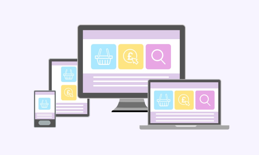
A responsive portfolio website is a type of website that is designed to automatically adjust its layout and content to fit the screen size of the device being used to access it. This means that the website will look great and be easy to navigate on any device, whether it's a desktop computer, a tablet, or a smartphone. This is in contrast to a fixed-width website, which has a set layout and does not adjust to fit different screen sizes.
Responsive design uses a combination of flexible grid layouts, images, and CSS media queries to ensure that the website automatically adjusts its layout and content to fit the screen size of the device being used. This allows for an optimal viewing experience for the user, regardless of the device they are using.
The responsive design approach is important for creative professionals, as it allows them to showcase their work in a visually appealing way to a wider audience, and it ensures that the website is easily accessible and navigable for potential clients and customers, regardless of the device they are using.
Importance of having a responsive website for creative professionals
For creative professionals, having a responsive website is crucial because it guarantees that their online portfolio or website is accessible and easy to see on a range of devices, including smartphones and tablets. This is crucial because many potential clients and customers may be using their mobile devices to browse the internet, making it challenging to navigate and view correctly on non-responsive websites. A flexible website can enhance engagement and conversion rates while also enhancing user experience. A responsive website can help with search engine rankings because Google's search engine algorithm prioritises mobile-friendly websites.
2. Key features of a responsive portfolio website
Ability to adapt to different screen sizes
Adapting to different screen sizes refers to the ability of a website or application to adjust its layout and functionality to effectively display and function on different devices with varying screen sizes. This can be achieved through the use of responsive design techniques, such as using relative units for layout and CSS media queries to apply different styles based on the screen size. It's also important to have a mobile-friendly design and to test the website or application on different devices to ensure that it is functioning correctly on all screen sizes.
Showcasing work in a visually appealing way
Showcasing work in a visually appealing way can be achieved through various design techniques and strategies. Some ways to make your work visually appealing include:
1. Use high-quality images and videos: Use high-resolution images and videos to showcase your work. This will make your work look more polished and professional.
2. Use a consistent color scheme: Choose a color scheme that complements your work and use it consistently throughout your portfolio. This will create a cohesive look and feel.
3. Use white space: White space can make your work stand out and make it more visually appealing. It also makes your portfolio easier to navigate.
4. Use typography effectively: Use different font styles, sizes, and colors to create hierarchy and emphasis on important information.
5. Use interactive elements: Interactive elements such as hover states, animations, and sliders can make your portfolio more engaging and dynamic.
6. Use grid-based design: Grid-based design will make your portfolio look organized and easy to navigate.
7. Showcase your process: Showcase your process, from sketches to final product, it will give a glimpse of your work style and methodologies.
8. Test and iterate: Show your portfolio to different people and gather feedback, iterate and improve your design.
By using these techniques, you can create a visually appealing portfolio that effectively showcases your work.
Easy updates and maintenance
Easy updates and maintenance refer to the ease with which a website or application can be updated and maintained over time. Some ways to make updates and maintenance easy include:
1. Use a Content Management System (CMS): A CMS makes it easy for non-technical users to update and maintain a website without the need for coding knowledge.
2. Use a modular design: A modular design allows for easy updates and maintenance by breaking down the website or application into smaller, reusable components.
3. Use version control: Version control systems like Git allow for easy collaboration and tracking of updates and changes.
4. Use automated testing: Automated testing can help to catch and fix bugs before they are deployed, reducing the need for maintenance.
5. Use a development and production environment: This allows for testing updates and changes before they are made live on the website or application.
6. Keep the code organized and clean: This will make it easier to understand and maintain the codebase over time.
7. Have a clear documentation: This will make it easy for new developers to understand how the website or application works and how to make updates.
By implementing these strategies, it will be easier to keep the website or application updated and functional over time, without incurring a large amount of maintenance cost.
Improved search engine optimization
Search engine optimization (SEO) is the process of improving the visibility and ranking of a website or a web page in search engine results pages (SERPs). There are many ways to improve SEO, including:
1. Keyword research: Finding the right keywords that people are searching for and using them in your website's content and meta tags.
2. On-page optimization: Optimizing the content and structure of your website to make it more search engine friendly.
3. Off-page optimization: Building backlinks from other websites to your own to increase your website's authority and visibility.
4. Content creation: Creating high-quality, relevant and valuable content that attracts and engages users.
5. Technical optimization: Improving the technical aspects of your website, such as site speed, mobile responsiveness, and structured data.
6. Measuring and analyzing: Utilizing analytical tools to track your website's performance and making data-driven decisions to optimize your SEO strategy.
III. Benefits of a responsive portfolio website
Increased visibility and attract more visitors
Increasing visibility and attracting more visitors to a website can be achieved through a variety of methods, including:
1. Search engine optimization (SEO): Optimizing your website for search engines so that it appears higher in search engine results pages (SERPs) and is more easily discoverable by users.
2. Paid advertising: Using paid advertising platforms such as Google AdWords or Facebook Ads to drive targeted traffic to your website.
3. Content marketing: Creating valuable and engaging content that attracts and retains visitors to your website.
4. Social media marketing: Using social media platforms to promote your website and attract visitors through shared links and social media ads.
5. Influencer marketing: Partnering with influencers in your niche to reach a larger audience and drive traffic to your website.
6. Email marketing: Building an email list and sending regular newsletters or promotional emails to drive visitors back to your website.
7. Networking and partnership: Networking with other website owners and businesses in your niche and forming partnerships to promote each other's websites.
Better user experience on any device
Improving user experience on any device can be achieved through several strategies, including:
1. Responsive design: Using a responsive web design approach that ensures your website adapts to the screen size and resolution of any device, including desktop computers, laptops, tablets, and smartphones.
2. Mobile optimization: Optimizing your website specifically for mobile devices by using smaller images, shorter paragraphs, and larger buttons for ease of use on smaller screens.
3. Navigation: Creating intuitive and easy-to-use navigation that is consistent across all devices and allows users to easily find the information they are looking for.
4. Speed optimization: Optimizing the speed of your website to ensure fast loading times on any device, including compressing images, minifying code, and using a content delivery network (CDN).
5. Accessibility: Making sure your website is accessible to users with disabilities by providing alternative text for images, using proper heading structure, and providing closed captioning for videos.
6. Testing: Regularly testing your website on different devices and browsers to identify and fix any issues that may affect the user experience.
7. Use of technology: Incorporating latest technology like Progressive Web App (PWA) for providing offline access, push notification and faster loading time.
Increased likelihood of attracting new clients
Responsive web design is a method of designing and building websites that allows them to adapt to the different screen sizes and resolutions of different devices. By using responsive design, a website can automatically adjust its layout and content to provide an optimal viewing experience for users, regardless of whether they are accessing the site on a desktop computer, laptop, tablet, or smartphone. This can increase the likelihood of attracting new clients as it improves user experience, making it more likely that people will stay on the website, find what they're looking for, and ultimately make a purchase or contact the business.
Ability to stand out from the crowd
Responsive web design can give businesses an advantage by helping them stand out from the competition. By providing an optimal viewing experience on all devices, a responsive website can make a business appear more professional and user-friendly, which can attract and retain more customers. Additionally, responsive design can also improve the website's search engine optimization (SEO) by ensuring that the website is easily accessible and readable by search engines, which can increase the likelihood of the website appearing in search engine results. By standing out with a responsive design, the website will have a better chance of being found by potential customers and it will be more likely to convert visitors into customers.
IV. Best practices for designing a responsive portfolio website
Choosing a clean, minimalistic design
Choosing a clean, minimalistic design for a website can have several benefits. One of the main advantages is that it can make the website look more professional and modern. A clean and minimalistic design often gives the impression of being well-organized and easy to navigate, which can help to create trust and credibility with users.
Another advantage of a clean, minimalistic design is that it can help to highlight the most important elements on the website, such as the company's products or services. This can make it easier for users to find the information they are looking for, and can increase the likelihood of them taking a desired action such as making a purchase or contacting the company.
Moreover, a minimalistic design can also improve website's performance and loading speed, as it often uses fewer elements, which reduces the amount of data that needs to be loaded, making the website faster and more responsive.
In summary, a clean, minimalistic design can help to create a professional and modern look, increase user engagement and conversion rates, and improve website's performance.
Including high-quality images, videos, or interactive elements
Including high-quality images, videos, or interactive elements in a responsive web design can greatly enhance the user experience and make the website more engaging.
High-quality images can add visual appeal to a website and help to create a more memorable and lasting impression on users. They can also be used to showcase products or services, and to help explain complex ideas or concepts.
Videos can be a powerful tool for engaging users and can be used to demonstrate products, services, or company culture. They can also be used to provide tutorials or instructions, which can be especially useful for e-commerce sites.
Interactive elements, such as forms, quizzes, or games, can also be an effective way to engage users and to make the website more interactive. They can also be used to gather data or feedback, which can be useful for improving the user experience or for making data-driven business decisions.
Overall, including high-quality images, videos, or interactive elements in a responsive web design can help to improve user engagement and make the website more memorable, and engaging, which can lead to increased conversions and better customer retention.
Incorporating responsive design principles
Incorporating responsive design principles into a website involves designing and building the website in such a way that it can automatically adjust its layout and content to provide an optimal viewing experience for users on different devices. This includes using flexible grids, images, and other elements that can adjust in size and position to fit the screen of the device being used.
Some key responsive design principles include:
• Flexible grid: Using a grid layout that can adjust to the screen size of the device being used.
• Flexible images: Using images that can adjust their size to fit the screen of the device being used.
• Media queries: Using CSS media queries to apply different styles based on the characteristics of the device being used.
• Mobile-first design: Designing for smaller screens first and then progressively enhancing the design for larger screens.
•Touch-friendly design: Making sure that buttons and other interactive elements are large enough to be easily tapped on touchscreens.
By incorporating responsive design principles, a website can provide a consistent and optimal user experience across different devices, which can help to increase user engagement, improve search engine rankings, and ultimately increase conversions and revenue.
Optimizing for search engines
Optimizing a website for search engines, also known as search engine optimization (SEO), is an important aspect of responsive web design. The goal of SEO is to improve the website's visibility in search engine results pages (SERPs) by making it more easily accessible and understandable for search engines. This can help to drive more traffic to the website and increase its visibility to potential customers.
There are several ways to optimize a website for search engines in a responsive design:
• Use a single URL for both desktop and mobile versions of a website, instead of having separate URLs for each version.
• Use structured data to help search engines understand the content of a website and to display rich snippets in SERPs.
• Use responsive design to ensure that the website is easily accessible and readable on all devices and screen sizes.
• Use responsive images to ensure that images are properly sized and optimized for different devices.
• Use a mobile-friendly testing tool to check that the website is properly optimized for mobile devices.
By optimizing a responsive website for search engines, it can improve its visibility and attract more organic traffic, which can lead to more conversions and revenue.
V. Conclusion
Recap of key points
Responsive web design is a method of designing and building websites that allows them to adapt to the different screen sizes and resolutions of different devices. Some key points of responsive web design include:
• Improved user experience: By using responsive design, a website can automatically adjust its layout and content to provide an optimal viewing experience for users, regardless of the device they are using.
• Increased likelihood of attracting new clients: Improving user experience makes it more likely that people will stay on the website, find what they're looking for, and ultimately make a purchase or contact the business.
• Ability to stand out from the crowd: A responsive website can make a business appear more professional and user-friendly, which can attract and retain more customers.
• Choosing a clean, minimalistic design: A clean and minimalistic design can give the impression of being well-organized and easy to navigate, which can help to create trust and credibility with users.
• Including high-quality images, videos, or interactive elements: These elements can greatly enhance the user experience and make the website more engaging.
• Incorporating responsive design principles: This involves designing and building the website in such a way that it can automatically adjust its layout and content to provide an optimal viewing experience for users on different devices.
• Optimizing for search engines: Optimizing a website for search engines, also known as search engine optimization (SEO), is an important aspect of responsive web design. The goal of SEO is to improve the website's visibility in search engine results pages (SERPs) by making it more easily accessible and understandable for search engines.
Encouragement for creative professionals to invest in a responsive portfolio website.
Investing in a responsive portfolio website can be a valuable asset for creative professionals. A responsive portfolio website can showcase the professional's work in a visually appealing way, and make it easily accessible to potential clients or employers.
Here are a few reasons why creative professionals should invest in a responsive portfolio website:
• Increased Visibility: A responsive portfolio website can help to increase a professional's visibility to potential clients or employers, as it can be easily viewed on different devices and screen sizes.
• Improved User Experience: A responsive portfolio website can provide an optimal viewing experience for users, regardless of the device they are using, which can help to create a positive impression on potential clients or employers.
• Increased Credibility: Having a professional and well-designed responsive portfolio website can help to establish the professional's credibility and showcase their skills and expertise.
• Better Opportunities: A responsive portfolio website can help to open up new opportunities for creative professionals, as it allows them to showcase their work in a dynamic and interactive way.
• Increased control: A responsive portfolio website allows the professional to have full control over their online presence, they can add, remove, or update their portfolio items, as well as change the layout,, design and overall structure of the website.
• Overall, a responsive portfolio website is a powerful tool that can help creative professionals to increase their visibility, improve their user experience, establish their credibility, open up new opportunities, and have more control over their online presence.
About the Creator
The Role of Technology in Modern Cricket
Introduction Cricket, like many other sports, has undergone a technological revolution in recent years. From broadcasting to umpiring, technology has played a crucial role in shaping the way the game is played and consumed. In this article, we will explore the impact of technology on the game of cricket and how it has changed the sport we know and love.
By maha siva3 years ago in Unbalanced
Strategy Before Software: Why Content Strategy Matters More Than Platform Technology
A strong content strategy matters more than platform technology because strategy shapes every choice a team makes. It guides tone, purpose, structure, and audience focus. Technology can help with speed and reach, but it cannot replace direction. A tool only works well when someone uses it with a clear plan. Without a strategy, even the best systems fail to connect with real people.
By James Kaminsky3 days ago in Education
"Beware the Ides of March"
Superstitious people may believe some days are unlucky. For instance, some think Friday the 13th is an unlucky day. Another day some people consider unlucky is March 15 because the English playwright William Shakespeare said in his famous play, Julius Caesar:
By Margaret Minnicksabout 5 hours ago in Education


Comments (1)
Well written and an easy read to understand responsive design!