
Navigating the Complex World of Platform-Specific Cover Art Guidelines
Delve into the specifics of cover art guidelines

In the ever-evolving music industry, cover art plays a crucial role in defining an artist’s brand and attracting listeners. However, each streaming platform has its own set of guidelines that must be adhered to. In this article, we will delve into the specifics of cover art guidelines for Apple Music and Spotify, and provide you with the tips and tricks to ensure your artwork meets these requirements. Understanding these nuances can help you create compelling cover art that not only meets platform standards but also enhances your music's appeal.
The Importance of Compliant Cover Art
Cover art is often the first impression your audience has of your music. Non-compliance with platform guidelines can lead to rejection or poor visual quality, impacting your brand image and listener engagement. Here’s a comprehensive look at the requirements for Apple Music and Spotify.
Apple Music Guidelines:
Resolution and Size:
Minimum: 1400 x 1400 pixels
Maximum: 3000 x 3000 pixels
Preferred format: JPEG or PNG
Content Restrictions:
No explicit content (nudity, violence)
Avoid using the Apple logo or any other branding
Text and Typography:
Avoid using too much text
Ensure readability on smaller screens
Color and Contrast:
Use high-contrast colors to ensure visibility
Avoid colors that blend into each other
Image Quality:
Use high-resolution images to avoid pixelation
Ensure the image is clear and not blurry
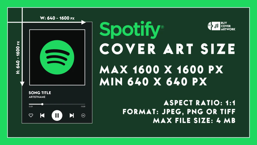
Spotify Guidelines:
Resolution and Size:
Minimum: 640 x 640 pixels
Preferred format: JPEG
Content Restrictions:
No explicit content or hateful imagery
Avoid using the Spotify logo or branding
Design Tips:
Keep the design simple and clean
Focus on high-contrast images for better visibility
Text and Typography:
Use minimal text
Ensure text is readable even in small sizes
Image Composition:
Centralize key elements to avoid cropping
Ensure important details are not on the edges
Best Practices for Creating Compliant Cover Art
Know Your Audience:
Tailor your design to fit the platform's user base. Apple Music users may prefer minimalist designs, while Spotify users might favor vibrant and dynamic images.
Consistency is Key:
Maintain a consistent style across all platforms. This helps in brand recognition and professional presentation.
Stay Updated:
Regularly check for updates to platform guidelines to ensure compliance. Platforms often update their guidelines, so staying informed is crucial.
Seek Feedback:
Get opinions from peers or professionals in the industry. Use feedback to refine and improve your cover art.
Use Professional Tools:
Utilize design tools like Adobe Photoshop or Illustrator for creating high-quality images. Consider hiring a professional designer if needed.
Common Mistakes to Avoid
Overloading with Text:
Too much text can make the cover art look cluttered and unreadable on small devices. Focus on key information and keep it minimal.
Ignoring Resolution Requirements:
Low-resolution images can appear pixelated and unprofessional. Always use high-resolution images that meet platform standards.
Overcomplicating the Design:
Simple and clean designs are often more effective and meet guidelines more easily. Avoid adding unnecessary elements that can distract from the main message.
Neglecting Brand Consistency:
Ensure that your cover art aligns with your overall branding. Consistency in style and colors helps in building a recognizable brand.
Forgetting About Mobile View:
Most users will view your cover art on mobile devices. Test your designs on small screens to ensure they look good and are readable.
Real-World Examples of Successful Cover Art
Examining successful cover art can provide valuable insights into what works well within the guidelines.
Example 1: Billie Eilish’s “Happier Than Ever”:
Design Elements: The cover features a clear, high-contrast image of Billie, with minimal text that is easy to read. This design adheres to both Apple Music’s and Spotify’s guidelines while capturing the album’s emotional tone.
Example 2: Drake’s “Certified Lover Boy”:
Design Elements: The cover art is simple yet impactful, with its use of emojis creating a visually striking and memorable image. It complies with platform guidelines by avoiding explicit content and maintaining high image quality.
Additional Resources for Artists
Platform Guides:
Check out the official Apple Music and Spotify guidelines for the most accurate information. These resources are regularly updated with the latest requirements.
Design Inspiration:
Look at successful cover art from popular albums and artists. Analyze what works and how you can incorporate similar elements.
Design Communities:
Join design forums and communities for feedback and tips. Websites like Behance and Dribbble are great for inspiration and networking.
Online Courses:
Enroll in online courses for graphic design and digital art. Websites like Coursera and Udemy offer comprehensive courses on cover art design.
Creating cover art that complies with platform-specific guidelines is crucial for ensuring your music gets the visibility it deserves. By following these tips and staying updated with the latest requirements, you can create cover art that stands out and complies with all necessary regulations. For more detailed insights, check out the full guidelines on Deliver My Tune.
What challenges have you faced with creating cover art for different platforms? Share your experiences in the comments below! Your insights could help fellow artists navigate this complex but essential aspect of music distribution.
About the Creator
Music Industry Updates
Welcome to Music Industry Updates, your go-to hub for the latest happenings in the music world.
Stay tuned, stay informed, and stay inspired with Music Pulse – where every beat counts.
Keep reading
More stories from Music Industry Updates and writers in Education and other communities.
Expanding Your Musical Horizons with Multiple Distributors
In the competitive world of music, getting your tracks heard by a wide audience is crucial. Utilizing multiple music distributors is a smart strategy to achieve this. This article explores how independent musicians can expand their reach and maximize their revenue by distributing their music through multiple channels.
By Music Industry Updates2 years ago in Education
Top 7 Life Changing Books to Read in 2026
In 2026, readers are not just looking for entertainment—they want books that change the way they think, feel, and see the world. With endless content available online, only a few books continue to stand out, remain widely read, and influence conversations across generations. These are the books people keep recommending, searching for, and returning to year after year.
By Waqar Khan4 days ago in Education


Comments
There are no comments for this story
Be the first to respond and start the conversation.