
How to create a high converting landing page
Learn the techniques on how to Build High Converting Landing Pages that converts a visitor to a customer.

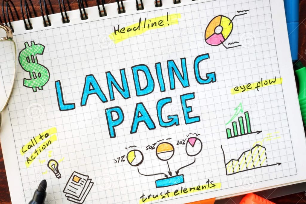
Y our Ultimate Guide to Building High Converting Landing Pages
Landing pages are very important to your lead generation strategy and Online success. Sometimes all you need to make a lot of money is one landing page with a good conversion rate.
I'll show you the evidence right here.
A single landing page, an alluring call to action, and a few emails from Conversion Rate Experts helped Moz make $1,000,000.

A high-converting landing page can serve as the basis of a prosperous internet business, even if you don't make that much money.
I'll delve into the components of effective landing pages in this post and demonstrate how to build landing pages that consistently convert successfully.
This reference will cover:
- Recognizing Landing Pages
- How Landing Pages work
- How to Boost the Conversion Rate of Your Landing Page
- D esigning your Landing Page
- Examples of Good and Bad Landing Pages
Let's begin...
Build high converting landing pages in minutes using this free recommended landing page builder tool
How do Landing Pages work?
Marketers often spend a lot of effort driving traffic to their websites and blog pages in the hopes that the target audience will participate in the opt-in process. However, if these websites don't inform and convert visitors into paying clients as well as draw them into your sales funnel, I t will be a waste of time and resources.
For this reason, creating effective landing pages requires more than just adding visuals, text, and a call-to-action (CTA) button, You absolutely need to make the landing page a positive user experience to get a higher conversion on email marketing.
Let's begin with the fundamentals:
What is a landing page? Any website to which you direct visitors in order to start a dialog and close a sale is referred to as a landing page.
Effective landing pages frequently function as independent web pages with a specific goal, such as a call to action that is directed at your target demographic
In order to create a successful landing page, you need to first of all understand the key elements of a successful landing page, What are the things that make a landing page work?
- Calls to Action (CTAs): A CTA is an illustration or phrase that prompts site users to take a particular action. CTAs on landing pages direct visitors to the appropriate link to access the offer. On your website's pages where your offer's material is relevant, as well as on pertinent blog entries that promote that content, you can place CTAs. A visitor is more likely to convert if the CTA is consistent with the landing page and other pages it is being advertised on.
Great Examples of CTA's that convert quickly
Most Common CTAs
Ecommerce Buy, Shop, Order, Reserve, Save, Add to Cart, Pick, View
SaaS conversion Try, Get Started, Subscribe, Sign Up
Non-profit conversion Donate, Commit, Volunteer, Adopt, Give, Support
Newsletter or community Subscribe, Join, Sign Up, Refer,
Freebie giveaway Download, Get, Grab, Claim, Take advantage of
General Learn More, See More, See How, Start, Find Out, Check it Out, Click here, Continue, Swipe Up
If you want to evoke an emotional response from your users, choose a longer CTA . In order to achieve the desired result in this situation, you will need to use more modifiers.
Here are a few examples:
Add numbers: “Buy now and get 50% off!”
Add adjectives: “Find your dream home with us!”
Make a promise: “Lose weight in just 6 weeks!”
Influence their FOMO: “Limited time offer. Get your free T-shirt!”
Play up your USP: “Order a hand-made soap now!”
2. The Landing Page: The form that a visitor must complete in order to access an offer is located on the landing page itself. Its sole objective, as previously indicated, is to promote lead generation by outlining the advantages of a specific offer. A visitor should be led to a "thank you" page after submitting the form.
Build high converting landing pages in minutes using this free recommended landing page builder tool
3. Thank You Page: Although most tools allow you to include an in-line thank you message, it is advised that you give your new lead access to a separate thank you page. New leads can get the download you promised on the landing page by clicking the "download now" button on thank you pages. Thank you pages are a great approach to extend the conversion process and advance the lead through the marketing funnel in addition to hosting the offer. On the thank-you page, further forms or targeted CTAs should be displayed to direct leads to secondary offers (case studies, consultations, webinars, and more).
Build Thankyou pages in minutes using this free recommended landing page builder tool
Key steps to increase conversion rate on your landing page:
1. Conduct Market Research: Researching your target market and clients is the foundation of any successful landing page in order to add value and deliver a positive user experience. Market research is crucial, and if necessary, you can conduct it on a tight budget. Fridge Magazine lists some of the well-liked channels you can use for market research.
How popular is your topic of interest? Whether there is any interest in your subject or blog post series is an important piece of information. Let's say you want to make a release for law consultants. What does the market demand look like there?
Tools like Google trends can be your quick guide, go to google trends and type your keyword into the search box
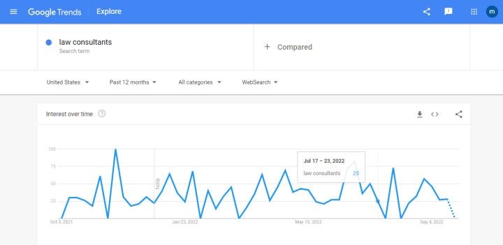
The graph above demonstrates the consistent interest in the search term "law consultants" in 2022. That's a fantastic place to start when choosing whether to create a landing page specifically for this niche. In Order to create a high-converting landing page, you have to understand the user's mindset, This is why landing page templates are very helpful. They have conducted extensive research and have developed a drag-and-drop technique to assist you in achieving higher conversion rates.
Quora is also a very helpful research tool, simply type your keyword into the search box
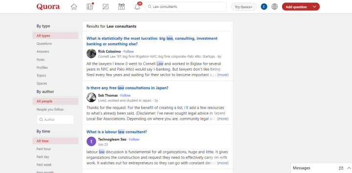
You'll find all the answers to questions about law consultants. This can assist you in deciding how to design your landing page and the subsequent subscription form.
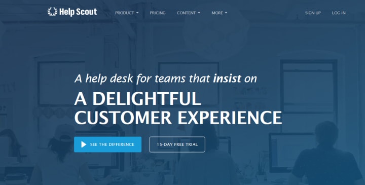
2. Create a Positive First Impression: According to an eye-tracking study mentioned by Conversion XL, it takes an average user's eyes 2.6 seconds to land on the area of your website that will make an impact. That period of time might perhaps be considerably shorter. People form impressions, according to Ion Interactive, in just one-twentieth of a second. In other words, visitors won't stay on your website for very long, thus first impressions matter. In order to entice your audience to stick around and convert from reader to customer, you can use landing pages.
Help Scout’s landing page got my attention and makes me want to try their service. That’s the impact of a great landing page layout that leads to a straightforward contact form or subscription form.
2. Use the components of trust: Do you realize that your visitors can be emotionally moved to act by the photos, videos, and graphics on your landing page? This is due to the fact that 40% of individuals react more favorably to visual information than to text. It results in a satisfying user experience.
3. Find other means to promote user engagement
User engagement is one of the elements that goes into a landing page conversion. Users should be drawn to your landing page to the point where they convert. Including videos on your landing page is one method to keep visitors interested. The number of conversions on your landing page might rise by 80% when you include video, You also establish credibility and communicate an interesting brand story through video. The longer consumers stay on your page, the more time they have to think about your brand, which eventually lowers your bounce rate.
Using interactive materials like quizzes, games, competitions, e-books, and infographics will help you take it further. Many prosperous brands employ landing pages to engage their customers. For instance, if your business sells automobiles. You can design a landing page with interactive content that enables consumers to alter the interior color of the vehicle to their preferred shade. You can design a landing page with a model whose outfit, shoes, and accessories are interchangeable if you sell clothing.
A good example is the Betterhelp landing page, the landing page is designed with their users in mind, you are given a personalized questionnaire that asks questions related to your therapy goals

You aren't shown the following questions until you respond to the first one.

When you've answered all questions, you are then shown the form where you can fill in your details.

3. Create a Clear Call-To-Action.
You cannot convert visitors into subscribers, leads, or customers without the use of a clear call to action button or link. A call-to-action button that works is easy to see, understand, and click. It ought to draw in consumers and persuade them to make the necessary move.
A call-to-action button has four distinct components that are crucial to your success, As follows:
Location: The call to action button's placement on your landing page is very important. It ought to be clearly visible where users may view it. Don't bury it under something or put it in a corner where it will appear hidden. Allow your users to see it right away when they arrive.
The color: Your CTA button's color should stand out against the landing page's background. An orange, blue, or green CTA is typically successful.
Size: The call to action button's size is also important. It shouldn't be too big so that users are scared away, nor should it be too little so that users miss it. It must be the appropriate size and complement the design of the landing page.
Content: The call to action button's message is very important. Your target audience should be persuaded to click it. It must be relevant to the services you provide to your customers.
Look at the landing page below. The CTA says, "Get Started free," which relieves the website visitors of strain. If customers don't like the service, they are not obligated to pay for it right away and won't be charged. It is understated and enticing.
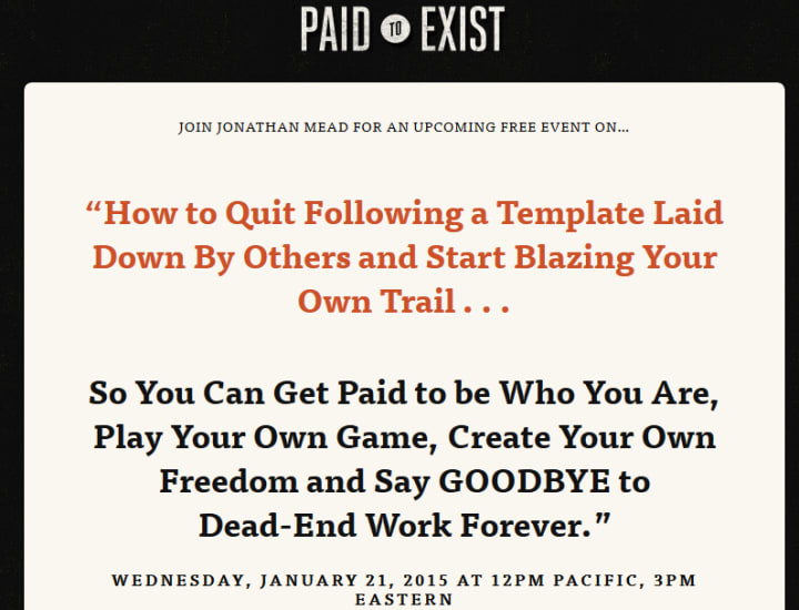
4. Remove Distractions: A well-designed landing page makes it simpler to collect email addresses than a standard blog or website where the only objective is to drive more visitors to a subscription form. This is because a landing page only serves one function, unlike your blog, which may emphasize showcasing popular content, accumulating email subscribers, or promoting affiliate products.
In an effort to cut down on distractions, some landing pages don't even include navigational components. This landing page by Jonathan Mead, the creator of Paid To Exist, serves as an illustration.
Designing Your Landing Page
There are various ways to d esign a landing page that converts well,
Landing pages with mainly text: The majority of internet marketers choose to create landing pages which are primarily text-based copy. They exclude huge images and video. Just few photos to stimulate the area of your brain responsible for processing visual data.
Since page load time has an impact on Google rankings, a text-based landing page's main benefit is speed for a good user experience.
A landing page with text will fulfill the promise of the headline swiftly. Copyblogger is a good illustration:
Copyblogger uses a CTA button instead of a text link, which is something that I do on my own site to make the CTA obvious and attractive.
Video landing page: According to PRNewswire, as YouTube, Vimeo, and other video sites gain popularity, revenue from online video platforms is expected to reach $910 million by 2025.
Video watching makes up one-third of all internet activity, according to recent data, and it's a terrific method to explain your goods or services to potential customers. For this reason, you ought to think about including video on your landing page. This is already being done by many prosperous online marketers.
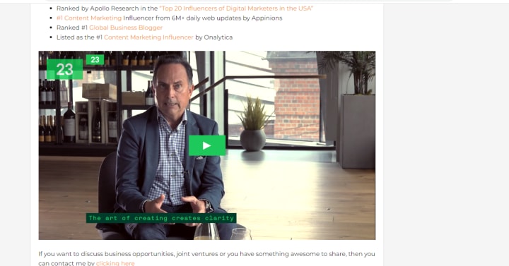
Here’s a video landing page from Jeff Bullas Blog, The Founder of Jeffbullas Pty ltd . This is his About page, but it’s cleverly designed to build his personal brand AND his email list.
No matter what your product or service is, adding a short video that walks the prospect/customer through your offer will improve your conversions as long as the opt-in process is simple too.
Benefits of using videos on your landing page are:
Retention: A compelling video will encourage viewers to stay on your page longer, allowing your message to sink in. Videos give your product life and a voice, which boosts trust.
Adapting to client preferences: According to Unbounce, many individuals would rather watch a 5-minute video than read an essay. Giving users what they want will increase conversion rates on your landing page.
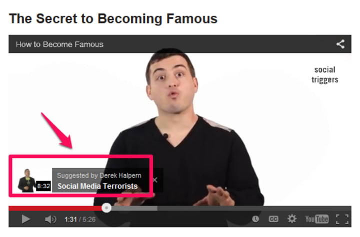
You must include a compelling call to action in your video. Here is a Derek Halpern illustration.
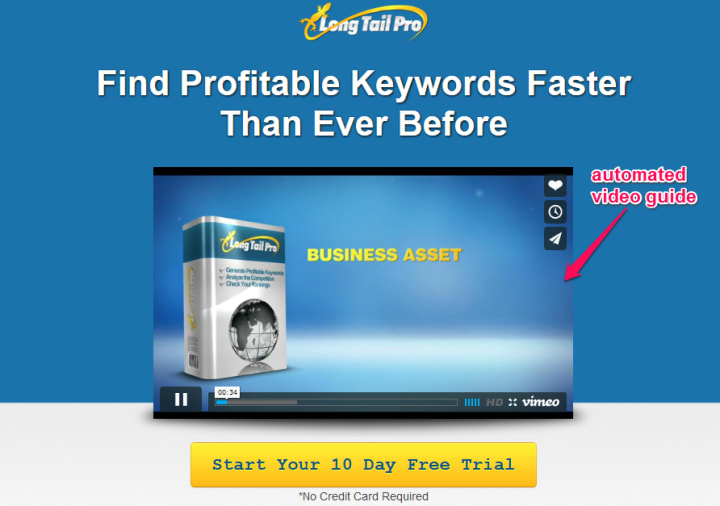
Videos can also demonstrate to customers how your product functions, which is essential if installation or configuration is required. For instance, when you go to Long Tail Pro, the video demonstrating what the keyword software can do for you and how to utilize it is instantly played.
Keep your landing page video short and useful, because desktop viewers tend to stick with videos for less than 5 minutes. In contrast, iPad video viewers stay and watch a video for up to 5 minutes.
Note: Sometimes you can have a hybrid landing page, where more than one element is used in the copy. A landing page builder can help you with ideas for this.
Build high converting landing pages with this free recommended landing page builder tool
Should the copy on a landing page be lengthy or short? Depending on the page, Yes. In the world of internet marketing, large copy landing pages are quite frequent. It's an excellent format to use when trying to convince a customer of the advantages of your goods or services.
On the other hand, if the sole purpose of your landing page is to collect email addresses from visitors in exchange for your free report, you may keep your material and page brief to improve user experience, encourage more visitors to complete subscription forms, and increase the number of opt-ins.
If for example, you are selling your premium package service at $1,699, you will have to give lots of detailed explanations for why someone should fill out the subscription form and pay for your service.
Two quick illustrations of good and bad landing pages: How can you distinguish between a good and a bad landing page?
I believe that the function a landing page serves is what ultimately matters. A landing page is effective if it can quickly and effectively resolve the reader's issue, But if it fails to please the user, it is a poor landing page. It's not just about the language, it's also about the CTA button's placement, color, and navigational simplicity. Don't make visitors search if you want them to convert.
Our first Example will be a Dog training Course landing page
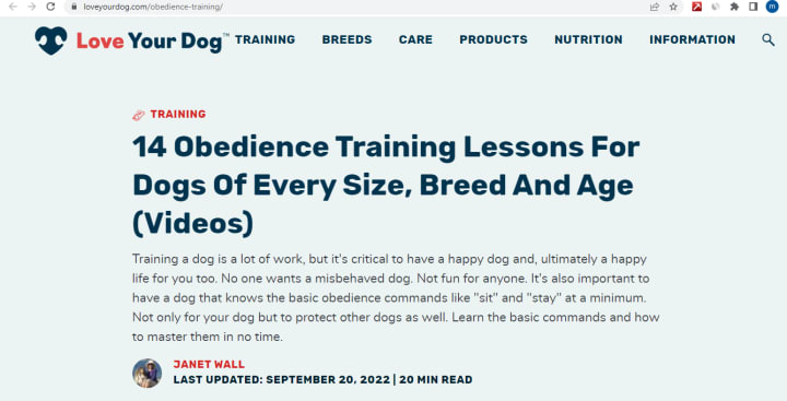
Why does this landing page work?
Although this landing page is more of text than images and is intended to be an educational resource to people looking to learn how to train a dog, Visitors who arrive on this page are immediately attracted to the bold heading which clearly states what the visitors are interested in. This is also a good use of the AIDA model, reading further the visitor is assured of learning the techniques to train a dog.
A Contrary Landing Page
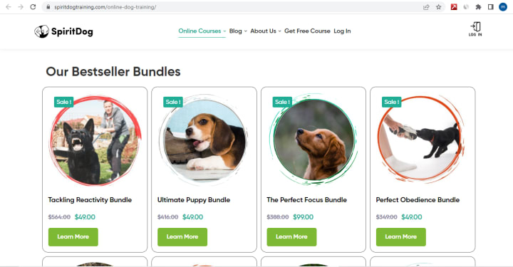
Why is this landing page bad?
First off, the landing page does not connect with the mind of the visitor, it's rather focused on selling out its Bundles without any immediate information on how to train a dog, and based on the second step to increase your landing page's conversion rate we outlined towards the mid section of this article which is to create a positive first impression, this landing page has failed this step and the visitor will move on to some other site with the information they are looking for.
A Second Example
This landing page is from a social media consultant agency called WebFx

Why does it work?
Everything seems right on this page, from the color choice to the font and alignment with little to no distractions, there's a bit of fresh air and you see from the hero section of the page, you are immediately drawn to the agencies service message to "Grow your brand" which is the main reason why you landed on the page. Reading further, they listed social media platforms you are probably growing your brand on which again keeps you interested in learning more about their offering. But this alone is not the killer tool that will convert a visitor, this agency went further to create a video that explains their services and shares a STORY of a client's success with them!
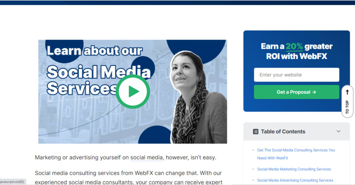
Their utilization of Video is a very powerful conversion strategy, the video presentation is well personalized to visitors and can easily convert. Another key thing to note is the alignment of the landing page, all elements of the page are well aligned. A landing page builder tool like systeme.io helps you create well structured landing pages using pre-built templates for free, Check it out here
A Contrary Example

From the look of this page, i am sure you are as confused as i am on what exactly to do on this landing page. Its obvious this agency paid little attention to web design, there's no alignment and contrast on this page, all elements of the page are fighting for your attention which is not a good quality of a web page.
A landing page can grow or break your business online, this is usually why web designers are paid huge amount of money to design a web page and this is the same reason why organizations like Moz generated $1million dollars in revenue from a single landing page, The good thing is you don't have to spend thousands of dollars to hire a professional web designer, you don't even have to spend a $100, landing page builder tools like systeme.io can help you create proven to convert, well designed landing pages with hundreds of templates to choose from for free. It has a forever free plan you can use today to test the tool and if you find it good enough, it offers affordable plans(most affordable in the industry) with other marketing tools like email campaign and automation with templates, list building and more to skyrocket your business. You also get 24/7 support. learn more about systeme.io
Be my next successful client Hire me to build high converting landing pages for your business
About the Creator
Emeka Dan
I have a passion for technology and everything in between. Technology affects our everyday lives; it affects the way we work and as a result makes life easier. On this Platform,I share with you technologies that saves you time and money.
How Early Hustle Jobs Build Real Mental Toughness for Life
Early hustle jobs—like babysitting, mowing lawns, stocking shelves, or working the drive-thru—might seem small on paper, but they often shape big psychological strengths. These first experiences with responsibility, pressure, and real-world expectations can build mental toughness in ways school alone usually can’t.
By David Lipan5 days ago in Education


Comments
There are no comments for this story
Be the first to respond and start the conversation.