
Dark Mode Design: Aesthetic or Essential?
Exploring the Rise of Dark Mode in Modern Web Design and Whether It’s a Visual Trend or a UX Necessity
Once seen as a sleek, techy option mainly for developers and night owls, dark mode design has taken center stage in the world of digital experiences. From mobile apps to full-fledged websites, more brands are embracing this shadowy aesthetic. But the question arises—is dark mode just a cool design trend, or has it become an essential part of modern web design?
Let’s break down why dark mode has become such a major trend, when it makes sense to use it, and how to know if your website really needs it in 2025.
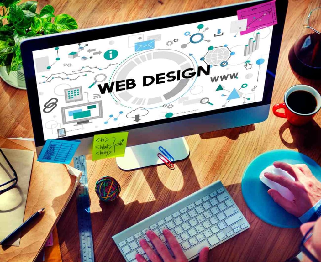
🌒 What Exactly is Dark Mode?
In simple terms, dark mode is a color scheme where the background is typically dark (usually black or deep grey), and the text and UI elements are light-colored. It essentially inverts the traditional light mode, where dark text appears on a white or light background.
Originally implemented in code editors and operating systems to reduce glare and eye strain during long hours of use, dark mode gained massive popularity with platforms like Twitter, YouTube, Instagram, and more recently, entire website layouts.
And now, it's not just for functionality—it’s a design choice, a brand statement, and a way to enhance user experience.
💡 Why is Dark Mode Trending So Hard?
Let’s explore why dark mode has become a key consideration in web design:
1. User Comfort in Low-Light Settings
A primary reason why users love dark mode is visual comfort. Staring at a bright screen for extended periods, especially in dim environments, can lead to eye fatigue, dryness, and strain. Dark mode offers a softer viewing experience, especially for users who browse at night.
2. Battery Efficiency
For devices with OLED or AMOLED screens, dark mode can actually help conserve battery. These displays can turn off individual pixels when showing black, which reduces power consumption. With mobile usage increasing every year, this is a win-win for both brands and users.
3. Modern and Futuristic Appeal
Design-wise, dark mode exudes a sleek, contemporary vibe. It gives a site or app a polished look that appeals especially to younger demographics and tech-savvy audiences. It also allows designers to play creatively with color, contrast, and minimalism in unique ways.
4. Enhanced Focus
Dark backgrounds allow key visual elements—such as buttons, images, or call-to-action text—to stand out more prominently. This contrast helps guide the user's attention, improving clarity and interaction.
5. Customization & Accessibility
Today’s users appreciate control over their digital experiences. Offering both dark and light themes provides greater accessibility and personalization. Users with visual impairments or those sensitive to brightness can benefit significantly from a well-designed dark mode.
🔍 Is Dark Mode Always the Right Choice?
Despite the many benefits, dark mode isn’t always the right answer for every website or audience. Here’s why:
⚠️ Branding Clashes
Not every brand's visual identity plays well with dark backgrounds. If your brand colors are light pastels, bright whites, or heavily saturated tones, they might lose visibility or aesthetic harmony in dark mode. This can dilute your brand’s impact.
⚠️ Readability Challenges
Designing for legibility is trickier in dark mode. Improper contrast, small font sizes, or low-opacity text can make content hard to read, especially for older users or those with visual impairments.
⚠️ Double the Design Work
Implementing a functional dark mode involves creating and maintaining an entirely separate theme, with adjusted styles, image assets, and testing across devices. It’s not just a color swap—it’s another layer of design and development responsibility.
Because of these limitations, many brands now treat dark mode as a complement to their light mode, rather than a full replacement—often integrated thoughtfully within a responsive and well-planned website design.
🧠 When Should You Add Dark Mode to Your Website?
Dark mode is most effective when it aligns with your audience’s expectations and your content’s context. Here are a few scenarios where dark mode is worth serious consideration:
You have a mobile-first audience that browses at night or in low-light settings.
Your users are tech-oriented—like designers, coders, gamers, or creators—who already expect dark mode options.
You want to differentiate your brand through a bold, modern design aesthetic.
You prioritize accessibility, giving users the ability to switch between themes.
Your content is visually rich—like photos, videos, or data visualizations—that benefit from a darker backdrop.
Even if dark mode isn’t a core part of your design right now, it’s worth including it in your future planning to stay aligned with evolving user habits.
✅ Final Thoughts
So—is dark mode aesthetic or essential?
The answer isn’t black and white (pun intended). While dark mode definitely adds visual appeal and practical value, it’s not automatically the right fit for every brand or website. Its effectiveness depends on your audience, platform, brand identity, and design capacity.
In 2025, however, what’s clear is that users expect more from web design—more flexibility, more comfort, and more control. Dark mode is no longer just a flashy trend; it’s quickly becoming a standard feature of quality digital experiences.
If you’re considering it, don’t just follow the trend—design it intentionally. Make it readable, beautiful, and on-brand. In doing so, you’ll be offering your users not only a cooler visual journey, but a more thoughtful one.
About the Creator
Keep reading
More stories from DigiSuccessPath and writers in Education and other communities.
How Do You Start Your Digital Marketing Career After Getting a Degree? Unlocking the Path to Success
Standing on the threshold of your digital marketing career is like holding the master key to a vault of endless opportunities. Your degree has equipped you with a foundation of knowledge, a toolkit of strategies, and a hunger to thrive in the fast-paced world of marketing. Yet, as exciting as this journey may be, taking the first step can feel overwhelming. How do you set the wheels in motion and carve your space in an industry brimming with potential? Fear not. Together, let’s decode the art of launching your digital marketing career with clarity, ambition, and purpose.
By DigiSuccessPath9 months ago in Education
Top 10 SEO Experts In Pakistan In 2026
Introduction Search optimization in 2026 no longer revolves around keywords or isolated ranking tactics. Google’s AI Overviews, entity-based indexing, and answer-first systems have changed how visibility is earned. Search engines now evaluate meaning, credibility, and contextual authority rather than mechanical signals.
By Sajid Ali Shar3 days ago in Education
Colors and Such
Before I retired in 2020, I worked as a Nursing instructor in one of the nation's largest community colleges. It was a job I thoroughly enjoyed for fifteen years because I had a heart for the students and genuinely wanted to invest in them and their futures.
By Shirley Belk5 days ago in Education


Comments
There are no comments for this story
Be the first to respond and start the conversation.