
Why Florida’s State Flag Is the Confederate Battle Flag
The Red “X

A visual explainer and historical analysis arguing that Florida’s saltire design—added in 1900—duplicates the Confederate battle emblem in both form and purpose, embedding Lost Cause politics into the state’s most visible symbol.
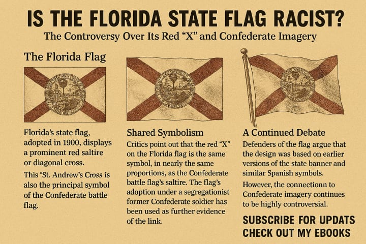
Visual Infographic (Overview)
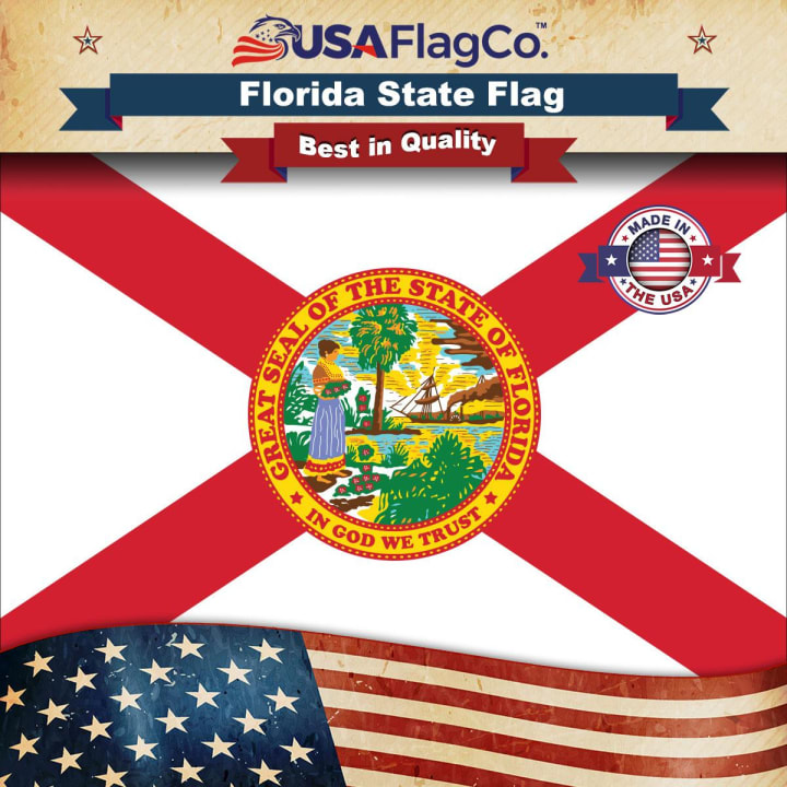
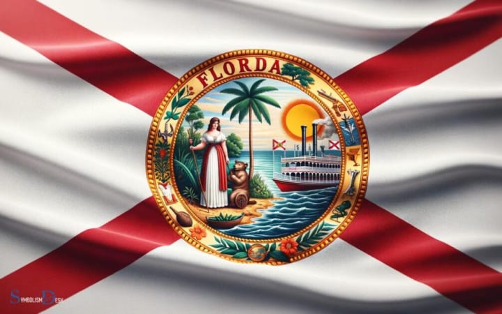
Panels included in the image above: Florida’s Flag — White field, red diagonal cross (saltire), state seal at center.
Shared Symbolism — The saltire is the core geometry of the Confederate battle flag; Florida’s adoption coincides with Jim Crow ascendance and leadership by a former Confederate.
Continuing Controversy — Defenders claim Spanish or anti–“surrender flag” rationales, but historians note the era and design closely track broader Confederate revival symbolism.
The Argument
1) Form: The Saltire Is the Confederate Battle Flag’s Essential Device
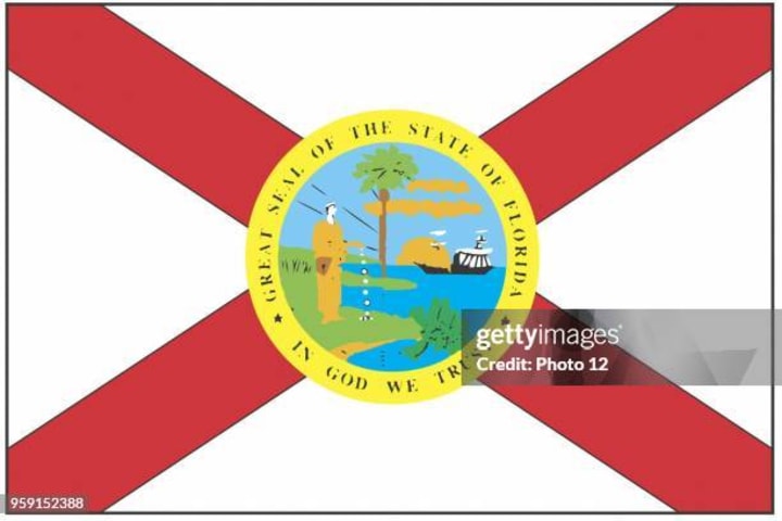
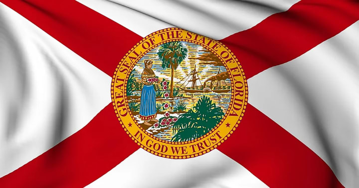
Strip away the stars and colors from the Confederate battle flag and what remains is its essential geometry: the St. Andrew’s Cross, a bold diagonal “X” (saltire). Florida’s flag places that same saltire—thick, centered, and dominant—on a white field, then adds the state seal at the crossing. Functionally, Florida’s flag preserves the Confederate device while localizing it with a seal. This is not merely resemblance; it is structural equivalence: a saltire as identity signal.
Some defenders argue that saltires are ancient, that the Cross of Burgundy flew over Florida in the Spanish era. True; but the question is not whether saltires exist elsewhere. It is why this saltire was added in 1900—decades after the war, during segregation’s consolidation—and why it so precisely mirrors the Confederate battle emblem’s visual grammar: a stark diagonal cross asserting dominance across the entire field.
2) Timing: Florida Added the Saltire in 1900—Peak Jim Crow Commemoration
Florida’s post‑war flag for decades was a plain white field with the seal (adopted 1868). Then, in 1900, the state amended the design to add the red saltire. That timing matters: the late 19th and early 20th centuries saw a wave of Confederate monument building, schoolbook rewrites, and state icon redraws—what scholars call the Lost Cause memory project. Even Alabama had adopted a near‑identical saltire flag in the 1890s, explicitly described by state historians as preserving features of the Confederate battle flag. Florida’s change falls squarely inside this movement.
The official story that the white field “looked like a surrender flag” and merely needed color does not negate the context: the chosen “color” was not a stripe, seal border, or canton—Florida chose the diagonal battle saltire, the central Confederate motif. The coincidence strains credulity. [wptv.com], [britannica.com]
3) Intent: Leadership and Advocacy at the Time Linked to Confederate Identity
The redesign has long been associated with Governor Francis P. Fleming, an ex‑Confederate, segregationist, and influential force in symbol politics. Contemporary critics and later commentators argue the red “X” was chosen to evoke the Confederate battle flag—an assertion consistent with broader southern political efforts to normalize Confederate identity in civic spaces. While some state historians say they have not found a single piece of paperwork explicitly stating “we did this for the Confederacy,” intent in public symbolism is commonly assessed through circumstantial evidence: actors’ backgrounds, the political climate, and parallel adoptions nearby. On each of those, the Confederate reading is the best‑fit explanation.
Legal scholarship reviewing the flag’s history reaches a similar conclusion: the symbol’s original meaning and received meaning can both be Confederate, even if archivists lack a single “smoking gun” memo. Motive can be inferred from context, sequence, and uptake—especially when a design becomes the centerpiece of a Jim Crow‑era identity.
4) Meaning in Use: Public Reception and Ongoing Confederate Symbol Fights
Symbols are not only about their origin; they are about how they are used and understood. Florida’s politics have repeatedly revisited Confederate imagery in public life—from the removal of battle emblems from government seals to fresh proposals to re‑authorize Confederate flags at government buildings. The fact that Florida’s saltire continues to anchor debates over Confederate memory shows that public meaning recognizes the connection—regardless of official denials. In semiotics, that social reading is decisive.
5) Counterclaims (and Why They Don’t Disprove the Connection)
Counterclaim A: Spanish Heritage
Yes, the Cross of Burgundy flew over Spanish Florida. But the 1900 choice did not reproduce the complex, ragged Burgundian form or a historically accurate colonial banner; it placed a clean, bold saltire with modern proportions used by Confederate revival designs. If “Spanish heritage” were the true aim, the flag could have showcased Spanish iconography already present in the seal or a historically faithful Burgundian field. It didn’t. The selection tracks Confederate revival aesthetics far more closely.
Counterclaim B: Preventing a “Surrender Flag” Look
Adding color could have been done in countless non‑Confederate ways (canton, border, rays, wreaths). The decision to choose the device that doubled as the South’s battle emblem, at a time when Lost Cause symbols were proliferating, is evidence of intent by selection.
Counterclaim C: No Direct Archival Proof
Public symbols rarely come with a signed confession. Courts, scholars, and civic debates routinely assess original meaning via contemporaneous politics and analogous adoptions (e.g., Alabama’s saltire) to determine whether a symbol encodes Confederate identity. The best historical inference—given the time, designers, and parallel cases—is that Florida’s red saltire was meant to evoke the Confederate battle flag and has been received that way ever since.

6) Design Analysis: Why the Eye Reads “Confederate”
From a design standpoint:
White field + dominant red saltire = the Confederate battle flag’s geometric skeleton. Center seal = a common localization technique to make supra‑regional emblems “state‑specific,” without changing the underlying signal. Proportions: The weight, angle, and reach of Florida’s saltire approximate the battle flag’s visual emphasis, turning the seal into ornament while the X carries identity.
Designers call this semiotic anchoring: the boldest shape communicates category first. When observers register Florida’s flag, the brain reads the X before the seal—just as it does with the Confederate battle flag.
7) Civic Impact: What It Means to Fly a Saltire in 2026
Public flags are teaching devices. When a state flies a symbol whose form, timing, and politics align with the Confederate emblem, the state tacitly teaches that the Lost Cause belongs in the center of civic identity. Florida’s saltire does that work every day—from classrooms to courthouses—regardless of any FAQ that mentions Spain. This is why debates flare with every new controversy over Confederate imagery: residents recognize the continuity, and communities who were targeted by Jim Crow policies experience the flag as a state‑endorsed echo of that past.
Conclusion
When judged by form (saltire geometry), timing (1900 Jim Crow consolidation), intent evidence (leadership and parallel adoptions), and public meaning (ongoing Confederate symbol controversies), Florida’s state flag is functionally the same symbol as the Confederate battle flag. The seal personalizes it, but the red X does the talking. That was true in 1900, and it remains true today.
Callouts for the Infographic (Text you can overlay on variants) “Same Device, Same Era, Same Message” Florida added the red saltire in 1900—during the expansion of Confederate civic symbolism.
“Not Just Similar—Equivalent”The battle flag’s core identity is its saltire. Florida’s flag centers the same device across the field. [britannica.com]
“Spanish Alibi vs. Jim Crow Reality” The Burgundian cross existed, but the 1900 choice mirrors Confederate aesthetics, not colonial accuracy.
Stay Connected
If this deep‑dive helped, subscribe for more visual explainers and check out my ebooks for expanded history features, ready‑to‑use classroom sets, and printable displays.
About the Creator
Organic Products
I was born and raised in Chicago but lived all over the Midwest. I am health, safety, and Environmental personnel at the shipyard. PLEASE SUBSCRIBE to my vocal and check out my store
Keep reading
More stories from Organic Products and writers in Chapters and other communities.
A Powerful, Personal Review of Kikoff
👉👉👉FOR MORE INFROMATION CLICK HERE Building credit today isn’t just about improving a number—it's about reshaping your financial future, increasing your independence, and opening doors that were once closed. Many people want better credit but don’t know where to begin, and traditional systems are often designed to make the process confusing, slow, or expensive. That’s where Kikoff comes in, and why I personally believe it stands out as one of the most effective, accessible, and stress‑free credit‑building solutions available.
By Organic Products 4 days ago in Chapters
FLUENT IN FORBIDDEN — CHAPTER FIFTEEN
"The clock has struck three, the coffee is cold, and the shadows are beginning to speak. Welcome back to the desk of The Night Writer, where the stories are brewed in the dark. Tonight, we find that the most dangerous place to be isn't in the line of fire—it’s in the memory of a man who has nothing left to lose but his secrets."
By The Night Writer 🌙 7 days ago in Chapters
Guard Your Battery
Why are some people so attractive just by standing there? It’s not because they are "likable," but because they don’t need everyone to like them. I realized later that truly charismatic people allow themselves to be criticized, but they never criticize themselves. They never try to please the world; instead, the world stops to watch them.
By Emily Chan - Life and love sharing3 days ago in Poets


Comments
There are no comments for this story
Be the first to respond and start the conversation.