
How to Create a Music Festival Poster: A Step-by-Step Guide
A Step-by-Step Guide

Designing a music festival poster is an exciting yet detailed process. It’s about more than just combining text and visuals—it’s about conveying the energy and atmosphere of your event in a way that appeals to your audience. Whether promoting a local show or a large festival, your poster often serves as the first impression for potential attendees. Here’s how to create a music festival poster that is both visually striking and effectively communicates all key details.
Why a Music Festival Poster is Important
A music festival poster isn’t just a piece of art; it’s a crucial marketing tool. Here’s what it does:
- Captures Attention: A well-designed poster stands out in crowded spaces.
- Communicates Key Details: The event name, date, venue, and lineup must be clear.
- Reflects the Festival’s Theme: It should visually embody the vibe of the festival, whether it’s a serene acoustic evening or an electrifying electronic dance party.
Step 1: Define Your Core Message
Before starting your design, determine the main message you want to convey. Ask yourself: What should people remember most about your festival? Is it the star-studded lineup, the unique location, or the once-in-a-lifetime experience? This central idea will guide every decision as you create a music festival poster.
Understand Your Audience
Your audience’s preferences will shape your design. Consider these factors:
- Age Group: Younger audiences might favor bold, modern visuals, while older attendees may prefer classic and understated styles.
- Music Genre: Match the design to the festival’s music style. Earthy tones suit a folk event, while vibrant, neon colors work well for pop or EDM festivals.
Craft an Engaging Tagline
Keep your tagline short but impactful. Examples like “Escape into Sound” or “A Weekend of Music and Memories” can set the tone and spark curiosity.
Step 2: Choose a Captivating Color Scheme
Color is one of the most impactful elements in poster design. The right palette can evoke the desired emotions and set the tone for your event.
Tips for Choosing Colors
- Match the Theme: Use blues and sandy tones for beach festivals or greens and browns for mountain events.
- Leverage Color Psychology: Bright colors like red and orange convey excitement, while blues and greens offer a sense of calm.
Build a Cohesive Palette
Start with a dominant color that represents the festival and pair it with complementary hues. Tools like Adobe Color can help create a harmonious palette.
Examples
- Reggae Festival: Use green, yellow, and red to reflect Rastafarian culture.
- Indie Festival: Soft pastels and muted tones create a relaxed, artsy vibe.
Step 3: Select Fonts That Match Your Event
Typography is a crucial component of your poster’s aesthetics. Fonts should be both visually appealing and easy to read.
Tips for Font Selection
- Headline Font: Use bold, distinctive fonts to make the festival name stand out.
- Body Text Font: Choose simple, legible fonts like Arial or Helvetica for details.
- Font Pairing: Stick to two or three complementary fonts. For instance, pair a decorative font for the headline with a clean sans-serif for additional text.
Ensure Brand Consistency
If your festival has a logo or style guide, ensure your fonts align with it. Consistency across all marketing materials reinforces your brand identity.
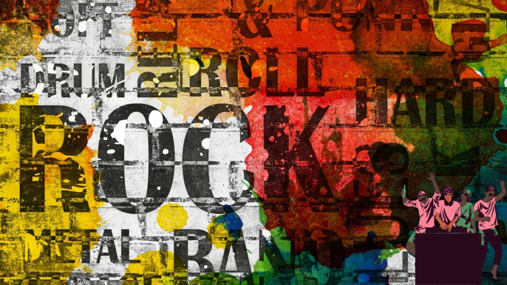
Step 4: Use Relevant Imagery
Imagery is a vital aspect of your design. The right visuals can instantly communicate the mood and style of your festival.
Choosing Images
- Relevance: Select visuals that represent the festival, such as instruments for a rock concert or abstract art for an electronic music event.
- Quality: Use high-resolution images to maintain professionalism.
- Balance: Ensure the imagery complements, rather than overwhelms, the text.
Creative Ideas
Abstract designs, thematic artwork, or bold graphics can make your poster stand out. For example, a jazz festival could feature stylized images of musicians or instruments.
Step 5: Establish a Visual Hierarchy
A well-organized layout ensures viewers quickly grasp the most important information.
Key Elements
- Size: The festival name should be the largest text, followed by the date, venue, and lineup.
- Color Contrast: Use contrasting colors to highlight essential details.
- Placement: Position critical information, such as the festival name and date, prominently at the top or center.
Example
For festivals with multiple performers, emphasize headliners in bold, large text and list supporting acts in smaller fonts below.
Step 6: Include Essential Information
Your music festival poster must provide all the necessary details in a clear, concise format.
Must-Have Details
- Event Name
- Date and Time
- Venue (including address or notable landmarks)
- Lineup
- Ticket Information (website link or QR code)
- Social Media Handles and Website
Keep It Simple
Avoid clutter by using white space strategically, ensuring the design remains clean and readable.
Step 7: Align with Your Festival’s Branding
Consistency across all promotional materials helps build recognition. Your music festival poster should reflect your overall branding.
Tips for Branding
- Use the same colors, fonts, and imagery across all platforms.
- Include your festival’s logo prominently.
- Ensure the design matches your website, social media, and email campaigns.
Step 8: Add a Clear Call to Action (CTA)
An effective CTA encourages viewers to take the next step, such as purchasing tickets or visiting your website.
Crafting a CTA
- Make It Visible: Position the CTA prominently, such as at the bottom of the poster.
- Use Actionable Language: Phrases like “Get Tickets Now” or “Secure Your Spot Today” create urgency.
- Design for Impact: Use bold fonts and contrasting colors to make the CTA stand out.
Step 9: Adapt for Multiple Formats
Your music festival poster should work seamlessly across both print and digital formats.
Print Versions
- Use high-resolution files (300 DPI) for sharp, professional prints.
- Common sizes include:
- 11″ x 17″ for small spaces.
- 18″ x 24″ for medium displays.
- 24″ x 36″ for large posters or billboards.
Digital Versions
- Optimize file sizes for faster loading.
- Adjust dimensions for specific platforms, such as square formats for Instagram or horizontal banners for websites.
Step 10: Test and Refine
Before launching your campaign, share your poster with a sample audience. Use their feedback to refine the design.
A/B Testing
Create two versions of your poster (e.g., different color schemes or CTAs) and measure which performs better using metrics like engagement or ticket sales.
Step 11: Launch Your Poster Campaign
Distribute your poster across both physical and digital channels. Collaborate with local businesses, influencers, and community groups to maximize reach.
Conclusion
To create a music festival poster that captures attention and drives attendance, focus on combining creative visuals with clear communication. By following these steps—defining your core message, selecting impactful colors and fonts, incorporating relevant imagery, and maintaining consistent branding—you’ll design a poster that not only attracts attention but also generates excitement and boosts ticket sales.
Related Articles:
For further reading, explore these related articles:
- Top Music Distribution Companies in India
- How Does Music Distribution Work?
- Create a Music Band Website
For additional resources on music marketing and distribution, visit Deliver My Tune.
About the Creator
Keep reading
More stories from Deliver My Tune and writers in Beat and other communities.
How to Create a Music Band Website: A Comprehensive Guide
Establishing a music band website is a crucial step in building your online identity and connecting with your fans. In today’s digital world, a well-crafted website serves as a central hub for showcasing your music, engaging your audience, sharing updates, and generating revenue through merchandise and ticket sales. Here’s an in-depth guide to help you create a music band website that is both professional and captivating.
By Deliver My Tuneabout a year ago in Beat
Review of 'Man on the Run'
My wife and I saw Man on the Run, a nearly 2-hour documentary on Amazon Prime, about Wings, Paul McCartney's group that flew around the world from shortly after The Beatles broke up in early 1970 to shortly after John Lennon was murdered at the end of 1980, making a Beatles reunion forever impossible.
By Paul Levinson10 days ago in Beat
Top Rappers in Dallas, TX (2026 Update)
Dallas doesn’t always scream the loudest in hip-hop conversations—but it builds quietly and consistently. While Houston often dominates Texas headlines, Dallas has carved out its own identity: melodic street records, independent grind culture, and a fast-growing streaming presence.
By RapRadarDigest7 days ago in Beat


Comments
There are no comments for this story
Be the first to respond and start the conversation.