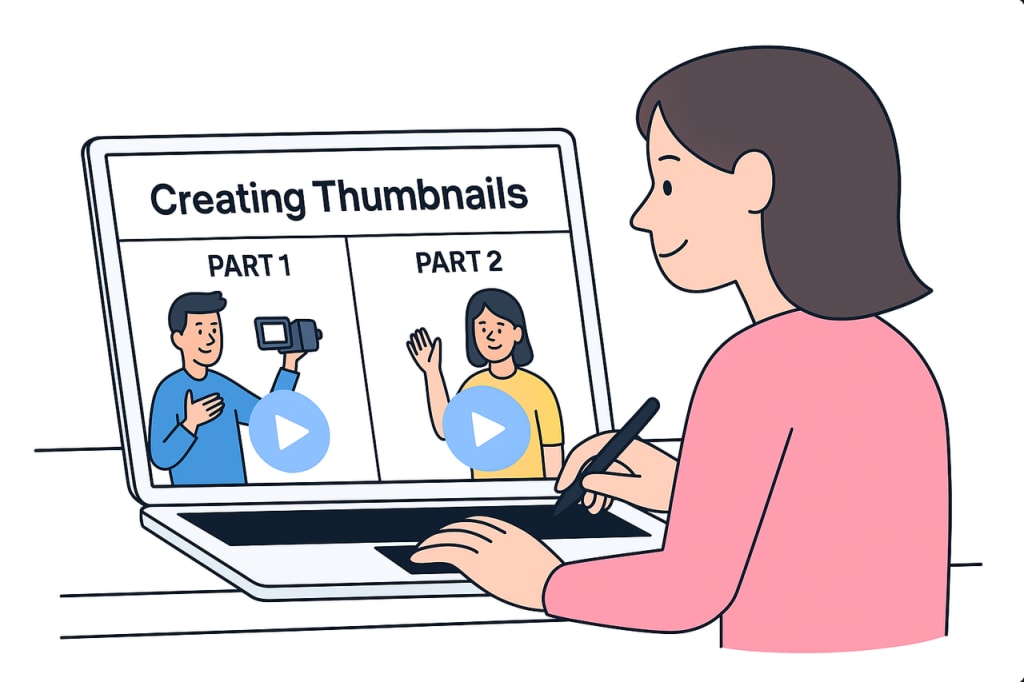
Why Your YouTube Thumbnails Might Be Failing
And What You Can Do About It

You’re creating solid content.
So why isn’t anyone clicking?
If you’ve ever poured your heart into a video and watched it underperform, this isn’t just a personal issue — it’s a common struggle. And the reason often lies not in the content itself, but in how it’s presented.
🚧 The Invisible Barrier: Packaging Overlooked
Most creators underestimate just how critical that tiny rectangle — the thumbnail — really is.
On YouTube, your video doesn’t just sit next to two or three others. It’s surrounded by hundreds of options competing for the viewer’s attention at any given moment.
If your thumbnail doesn’t spark curiosity, evoke emotion, or communicate value instantly, it gets ignored.
No second chances. No pity clicks. Just a scroll past.
Even a clever title or strong content won’t save you if the visual doesn’t pop.
“People don’t click on the best video — they click on the most appealing preview.”
It’s harsh, but it’s how the algorithm — and the human brain — works.
🧠 Why Thumbnails Are Hard to Get Right
Creating a high-converting thumbnail is like solving a puzzle with five competing constraints:
• 🧲 Grab attention instantly — through colors, contrast, composition.
• 😲 Evoke emotion or curiosity — a subtle facial expression, an intriguing object.
• 🎯 Align with the video’s core message — without spoiling or misleading.
• 📱 Stay legible on all devices — even on a tiny phone screen.
• ✨ Look polished, not templated — standing out without feeling fake.
That’s a lot to balance — especially when you’re already busy scripting, shooting, editing, and promoting.
And let’s be honest:
The classic “pause the video, take a screenshot, slap some text on it” approach?
It doesn’t cut it anymore.
Viewers are more discerning. Competition is fiercer.
Your thumbnail can’t just be okay — it needs to sell.
📉 How Bad Thumbnails Drain Good Videos
Let’s get mathematical for a second.
Say your thumbnail gets a 2% click-through rate (CTR). A similar video in your niche gets 6%.
That’s 3x the exposure — for content that might not even be better.
The algorithm notices.
More clicks = more impressions = more opportunities to be discovered.
But here’s the kicker: bad packaging doesn’t just limit your reach today — it hurts your future visibility too.
YouTube favors what’s already being clicked. If you miss that first wave, even great content can sink without a trace.
💥 It’s Not Laziness. It’s a System Problem.
Creators don’t fail at thumbnails because they’re lazy.
They fail because the entire process is:
• Unclear — What works? What doesn’t? There’s no real-time feedback.
• Slow — Thumbnail design becomes a time sink, delaying uploads.
• Guesswork — You’re tweaking colors and fonts, hoping for a miracle.
Most design tools weren’t built for YouTubers. They’re generic. Static.
You’re left trying to squeeze creativity out of Canva or Photoshop at 2am.
And when the thumbnail flops? You still don’t know why.
⚡ The Turning Point: Automating the Creative Edge
Recently, a new generation of tools has emerged — built for creators, not graphic designers.
Instead of starting from a blank canvas, these tools offer:
• AI-powered layouts that already follow best-performing patterns.
• Font and color pairings optimized for CTR and legibility.
• Thumbnail heatmaps to preview where attention will go.
• Real-world A/B test data from similar videos.
This changed the game for me.
Now I spend less than 10 minutes per thumbnail — and they look 10x better.
No more second-guessing. No more staring at blank Photoshop files.
Here’s what I noticed:
• A 30–40% boost in click-through rate on average.
• Faster upload cycles — no more thumbnail delays.
• More confidence going live, knowing I’m putting my best visual forward.
It didn’t just save me time — it gave my videos a chance to win.
🛠️ If You’re Ready to Fix This Too
After testing over a dozen tools (and wasting a lot of time), only one consistently balanced speed, creative control, and real results.
It’s called Pikzels — and it became my go-to for thumbnail creation.
I still choose the final version, but now I start with data-driven suggestions, not a blank screen.
It doesn’t replace your style — it elevates it.
And it’s built specifically for creators like you.
If your videos are worth watching, let’s make them worth clicking, too.
🧭 Final Thought
Good videos don’t get clicks.
Clickable videos get clicks.
You’re already putting in the work.
Don’t let your packaging hold you back.
Your thumbnail isn’t decoration — it’s your first impression.
Make it count.
About the Creator
Scott Ross
To survive is to find passion in your journey.


Comments
There are no comments for this story
Be the first to respond and start the conversation.