
Why Your 2025 Presentations Fail: The “Quiet Luxury” Hack Powered by PopAi & Morandi Aesthetics
Are you still pulling all-nighters fixing alignment and color palettes?

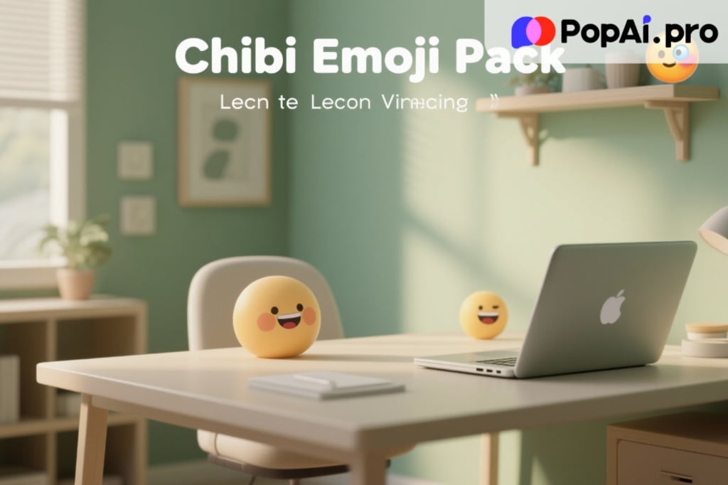
Description
Are you still pulling all-nighters fixing alignment and color palettes? The era of "ugly productivity" is over. As we approach the end of 2025, we analyzed why most corporate decks get ignored and uncovered a workflow shift top creatives are already using. This article explains how PopAi’s Morandi Color Scheme Minimalist Magazine slides transform complex data into refined visual narratives—and why this approach is becoming essential for modern presentations.
Introduction: The "Ugly Slide" Epidemic of Late 2025
It is December 2025. You are likely staring at a glowing screen, surrounded by empty coffee cups, wrestling with a year-end report that refuses to look right. You have the data and the strategy, but the presentation still looks outdated.
In the fast-paced creative and corporate environment of late 2025, a clear design shift is underway. Loud visuals—neon colors, heavy fonts, crowded slides—are rapidly losing favor. In their place is a softer, calmer aesthetic widely described as Quiet Luxury. It emphasizes clarity, restraint, and confidence rather than noise.
The problem is that achieving this effortless, high-end look traditionally requires hours of manual design work. That is where PopAi-driven AI workflows are changing expectations.
The Psychology of Visual Burnout
Visual overload is no longer a theory—it is a daily reality. Executives and clients review dozens of presentations each week, and cluttered slides often trigger instant disengagement.
This is where the Morandi Color Scheme becomes relevant. Inspired by Italian painter Giorgio Morandi, this palette uses muted, low-saturation tones such as dusty pinks, sage greens, and soft greys. The effect feels premium without being distracting. Instead of demanding attention, it creates visual trust.
Many professionals attempt minimalism but struggle with balance. Without proper layout and color harmony, slides can quickly appear empty or unfinished. This is the common failure point.
PopAi: The Core Engine Behind Quiet Luxury Slides
Most people still use AI only for generating text. In practice, that represents a small fraction of what modern AI platforms can do.
PopAi bridges the gap between content and design. Rather than producing isolated paragraphs, it interprets structure, hierarchy, and flow. One of its most notable capabilities is the automatic generation of Morandi Color Scheme Minimalist Magazine slides, combining editorial layouts with muted aesthetics.
The "Chat With Document" Workflow
PopAi’s workflow begins with documents. Users upload PDFs, Word files, or presentations, and the AI analyzes meaning instead of simply summarizing text.
Key points are extracted and reorganized into slides that prioritize whitespace, balance, and readability. This eliminates hours of copy-paste work and produces presentations that feel intentional instead of rushed.
Why the Minimalist Magazine Style Converts
Magazine-style layouts have shaped how people consume information for decades. Compared to dense reports, magazines guide the eye using spacing, typography, and imagery.
In presentations, this approach turns information into narrative. Slides feel curated rather than assembled.
With this style, PopAi automatically applies:
- Morandi color grading for visual consistency
- Layout logic that adapts to data, quotes, or ideas
- Image selection that avoids clichéd stock visuals
A Real-World Test
To evaluate the workflow, a fictional pitch deck for a sustainable coffee brand was created.
- Input: raw text and source material from online content
- Command: generate a presentation using the Morandi Color Scheme Minimalist Magazine slides style
- Result: a complete multi-slide deck produced in seconds, featuring calm color transitions, readable charts, and consistent typography
Only minimal edits were required afterward.
Time, Cost, and Practical Value
Designing a quality presentation traditionally requires significant time or outside help. Even small efficiencies can translate into real value.
Paid tools unlock faster processing, higher-quality visuals, and more consistent results. For professionals producing frequent decks, these advantages compound quickly.
Where Technology Meets Aesthetics
PopAi signals a shift in how design knowledge is distributed. Color theory, spacing, and hierarchy—once limited to trained designers—are increasingly automated.
The Morandi palette is not a trend alone; its low contrast reduces eye strain, while warm tones improve engagement. When paired with minimal layouts, the focus naturally shifts to message clarity.
Looking Toward 2026
As digital standards continue to rise, default templates increasingly signal low effort. Audiences now expect presentations to be clear, calm, and visually intentional.
AI-assisted design is not a shortcut—it is an efficiency upgrade. It allows professionals to meet higher expectations without increasing workload.
Conclusion
Presentation quality shapes perception. In an environment overloaded with information, restraint can be a competitive advantage.
By combining Morandi aesthetics with intelligent tools like PopAi, complex ideas can be transformed into clear, persuasive stories. In a noisy landscape, quiet design often makes the strongest statement.
About the Creator
Keep reading
More stories from charliesamuel and writers in 01 and other communities.
Understanding Handbags: Design, History, and the Rise of Replica Christian Dior Bags
Handbags have long been more than simple accessories. As outlined in the general definition of a handbag, they are functional items designed to carry personal belongings while also reflecting cultural trends, craftsmanship, and personal identity. Over time, handbags have evolved alongside fashion movements, social change, and consumer behavior, becoming key symbols in both everyday life and high fashion.
By charliesamuel7 days ago in 01
How Businesses Actually Choose the Best SEO Services Today?
Most businesses do not begin their SEO search with excitement. They begin with frustration. They have tried agencies that promised rankings without explaining trade-offs. They have paid for reports that looked impressive but changed nothing. By the time they start looking again, the question is no longer who sounds confident. It is who understands consequences.
By Jane Smith4 days ago in 01


Comments
There are no comments for this story
Be the first to respond and start the conversation.