
Why Logo's Keep Getting Flat? Flat Is the New Thing
The time of 3D has passed, and we’re going back to 2D.


Hey! what's happening?
Why is everything losing the third dimension?
The time of 3D has passed, and we're going back to 2D. But don't worry, it's for the better! Let's start from the very beginning. Back in the 19th and 20th centuries, before the computer era, company logos were obviously, made in 2D. I mean, they were mostly hand-drawn works of art! Just take a look at this 1976 Apple logo - it's nothing short of masterpiece!

Why did it change later?
Well, I'll tell you that in a couple of minutes, stay with me!
Anyway, old logos were often quite elaborate as if companies tried to outwit one another and just didn't know where to stop. This is understandable considering you had to stand out from the crowd to be on top. Professional artists and designers were often hired to make a brand instantly recognizable. This is especially obvious in the second half of the 20th century, when companies emphasized a simple, memorable logo. That means by the end of the century, companies understood that their customers didn't need to see works of art - they needed something that caught their eye and kept their attention. That started the era of logos as we know them.
Soon after the computer and mobile age came, and every home was set up with at least one PC and cell phone. As you know, the first cell phones had buttons, not touch screens, and a keyboard and mouse just like today. Now that I'm saying it, that strikes me as rather weird.
Let's play the associations game!
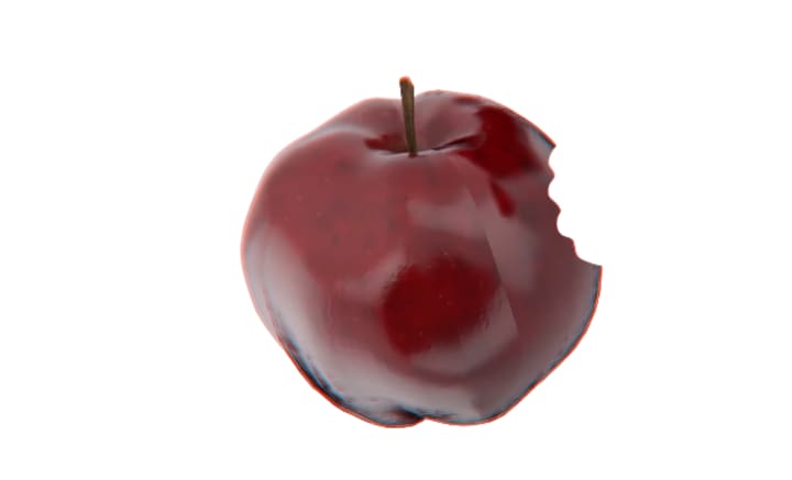
I show an apple with a bite taken out of it and you tell me what you thought of first?
Or how about a curvy check mark?

Apple and Nike - Bingo!

Today we recognize a company by its logo faster than by its name but what makes a logo successful? Going Flat is the answer.
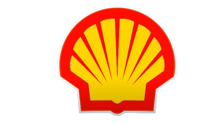
The first logos appeared in ancient Egypt. People back then use hieroglyphics to mark their property. Later in medieval times people use graphic imagery to recognize the status of different houses. When industrialization was at full speed the number of companies grew. Brands needed to stand out from the crowd somehow. So they added eye catching colored images to their names, one of the first companies to do that was shell. In 1897 the company's founder choose a mussel shell for the logo because his father was an importer of seashells to Landon collectors. Today it's one of the most familiar commercial logos in the world.
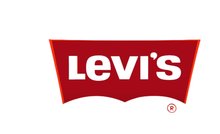
Levi's is known for its iconic two-horse logo. The image of horses trying to pull apart a pair of jeans was created in 1886. It was made to show customers how durable the company's jeans are. Over the years the brand created two other logos the red tab and the batwing. This second represents the shape of the back pocket on a pair of 501s.

Overtime Logos became more elaborate and sophisticated. Some being nothing short of a masterpiece but in the second half of the 20th century the designers realized that a logo should be cleaned, catchy and easy to remember. That's when brands turned their heads to simplicity. The person who changed everyone's opinion on visual communication was Paul ran, he created the eight bar IBM logo which made the company's initials instantly recognizable throughout the world. Rand style still has a huge impact on graphic designers today.

The coming of the digital era paved the way for companies to use dynamic logo types. A prime example of this is Google Doodles changing the logo on the main page. It can change the content but the overall structure remains the same, there used to remind us about holidays, achievements and some historical events and figures. Now look at the footer of the search page! The logo type can stretch with an additional 'O' for each page results.


Even when touch screens came around not everyone was ready to switch from reality to the virtual world. To adapt these innovations easier designers made 3D icons for gadget screens. They added shadows, volume and textures to the images to make them look like a real thing. A design concept called Skeuomorphism, sounds like you can be treated with medication for companies took note and made their logos more 3D looking. As the world got more used to knew technologies designers shifted back to 2D.
The minimalist flat design became popular.
Flat design was preferred over 3D because it gave more screen space for functionality, another advantage of this flat design is that 2D logos look good on both small and large screens. Still some companies were firmed to 3D logos but the world changed when Apple announced the iOS 7 in June 2013. This operating system was the first to get rid of skeuomorphism. The new design pushed more developers to flatten their apps to be in tune with the operating system. Just a year later, more then 90% of iPhones were running on iOS 7. After the jump to a more practical flat design the 3d became obsolete now, even companies outside the tech industry. Like Volkswagen simplified their logos to be more minimal.

But some companies have used the same logo for decades like Chupa Chups. This logo type was designed in 1969 by the surrealist artist Salvador Dali.

Coca-Cola was using its famous script in advertisements back in 1886. Later the brand adopted its distinct red color.

Some other examples of transition of company logos

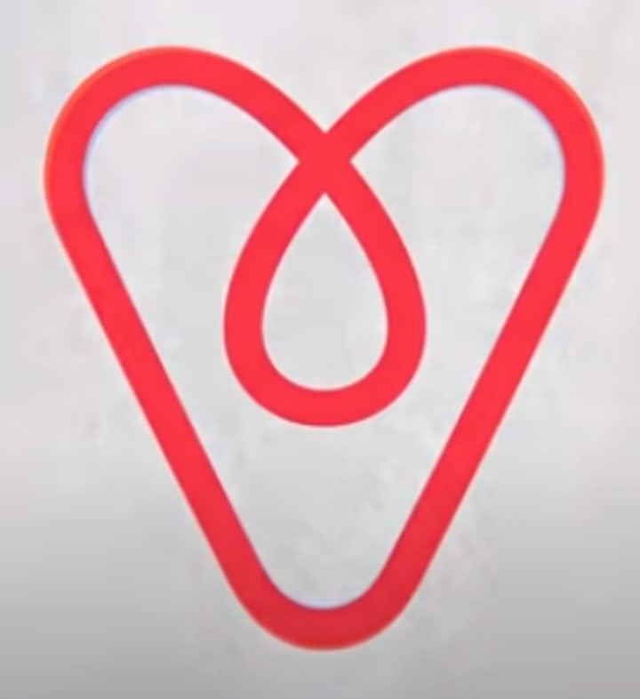
Effective logo should not only be simple and distinctive but also have a smart concept. Just look at the Airbnb logo it combines three symbols;
( i ) The head of a traveler.

( ii) A location icon.

( iii ) A heart.
The representation of any company matters more than its product.
Hope you like it.
About the Creator
Zeeshan Mushtaq Lone
I'm a student and I also have conducted a marketing survey with ITC Limited. Multinational conglomerate company.
Keep reading
More stories from Zeeshan Mushtaq Lone and writers in 01 and other communities.
How a Local Exterminator Handles Rodent Infestations: Complete Rodent Control Guide
Rodent infestations are a common problem in both homes and businesses. Mice and rats can enter buildings through very small openings, contaminate food, damage property, and spread harmful diseases. Because rodents reproduce quickly, even a small problem can grow into a serious infestation in a short time. This is why professional rodent control is essential for protecting your property and health.
By Jamal Mooreabout 11 hours ago in 01
How to Implement Scalable AR Try-On Features in Retail Apps (2026)
AR Try-On Features - Building for Retail Apps 2026 is a critical technical process. It integrates real-time spatial computing with advanced computer vision. This allows users to visualize products directly on their own bodies. You can boost your conversion rates today. You can also reduce expensive product returns. Do this by implementing high-fidelity AR Try-On Features for Retail Apps in 2026.
By Devin Rosario8 days ago in 01
A More Human Vocal
When we launched Vocal nearly a decade ago, the world was a very different place. LLMs did not exist, and stories were created one at a time by people sitting down to write, revise, and share something personal. Many of our assumptions about publishing, trust, and participation were built for a world where effort and output were inseparable.
By Justin @ Vocal5 days ago in Resources


Comments
There are no comments for this story
Be the first to respond and start the conversation.