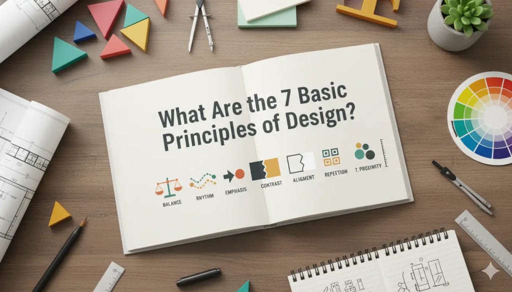
What Are the 7 Basic Principles of Design?
How These 7 Principles Define Successful Graphic and Visual Design

Introduction
Design is everywhere from the billboard you see on your way to work to the smartphone interface you use daily. But what makes certain designs stand out while others fail to grab attention? The secret lies in the 7 basic principles of design. These principles act as the foundation of every creative work, guiding artists and designers in building visuals that are both functional and aesthetically pleasing.
1. Balance
Balance gives your design stability. It’s about distributing visual weight evenly so that no part overpowers another. You can achieve:
Symmetrical balance: When elements are mirrored evenly on both sides.
Asymmetrical balance: When different elements have equal visual weight without being identical.
Radial balance: When elements radiate from a central point, like spokes on a wheel.
A well-balanced design feels calm and visually comfortable.
2. Contrast
Contrast helps differentiate elements. It’s what makes text pop off the background or key visuals stand out. You can create contrast using color (light vs. dark), size (big vs. small), and typeface (bold vs. thin).
Without contrast, everything blends together, making your design appear flat and dull.
3. Emphasis
Emphasis directs the viewer’s attention to the most important part of the design. It’s achieved by making certain elements stand out using color, shape, or size.
For instance, if you’re designing a call-to-action button, using a bright, contrasting color will instantly draw attention to it.
4. Movement
Movement in design isn’t about motion but about guiding the viewer’s eyes across the layout. Lines, shapes, and patterns can all create a visual path.
For example, a photo of a person looking in a particular direction subtly guides the viewer’s attention to that part of the design.
5. Repetition
Repetition creates rhythm and consistency. By repeating fonts, colors, and patterns, your design becomes cohesive and easy to recognize.
Think of brands like Coca-Cola or Apple—their repeated use of design elements builds familiarity and trust.
6. Proportion
Proportion deals with the size relationship between different elements. Proper proportions ensure that everything feels balanced and realistic.
In packaging or product design, the proportion of text to imagery can determine readability and visual appeal.
7. Unity
Unity ensures all parts of a design work harmoniously. It’s the glue that ties everything together. When colors, shapes, and typography align well, your design feels intentional and complete.
A lack of unity leads to visual confusion and disconnect.
How the Principles Work Together
While each principle is powerful alone, they truly shine when combined. For example, using contrast and balance together creates visual interest while maintaining order. Similarly, unity and repetition build brand consistency across multiple designs.
Practical Application in Real Projects
Whether you’re designing a logo, website, or brochure, applying these principles makes your work more professional and appealing. For packaging designers, these concepts ensure that the product catches the customer’s eye and communicates value effectively.
For example, in Custom Printed Display Packaging, combining contrast, repetition, and proportion can enhance visibility and brand recognition.
Why These Principles Matter in Modern Design
In today’s digital-first world, attention spans are shorter than ever. These design principles help ensure that your visuals communicate clearly and attractively. They are key to building trust, encouraging engagement, and creating memorable brand identities.
Common Mistakes Designers Make
Many beginners either overuse or completely ignore one or more principles. Overusing contrast can create clutter, while ignoring balance can make designs feel unstable.
- Always aim for moderation balance creativity with control.
- Example: Applying Principles to Product Packaging
Imagine you’re designing a cereal box. Using contrast, you highlight the logo; with balance, you position nutritional information neatly; and through unity, you keep the color palette consistent with brand identity.
This approach ensures the packaging isn’t just beautiful but also functional and marketable.
Tips for Mastering Design Principles
Study professional design layouts regularly
- Practice using grid systems
- Analyze successful brand designs
- Keep your color schemes simple
- Always seek feedback before finalizing
Design mastery doesn’t come overnight it’s a process of experimentation and growth.
Conclusion
The 7 basic principles of design—balance, contrast, emphasis, movement, repetition, proportion, and unity—form the backbone of every successful visual composition. By understanding and applying them effectively, you can create designs that not only look great but also communicate meaningfully. Whether you’re a student, a designer, or a brand owner, mastering these principles will elevate your creative work to a professional level.
About the Creator
Larry Clark
I am a dedicated and skilled professional specializing in custom packaging solutions. With a deep understanding of packaging design, I focus on creating high-quality, tailored boxes for cakes, food, and cosmetics.


Comments (1)
Hey there, I just finished reading your story, and I really liked it. I have some great ideas related to your story, and I want to share them with you.