
The Science of Colours: What Works Best for Real Estate Print Marketing?
Influence of Colours on Real Estate Marketing
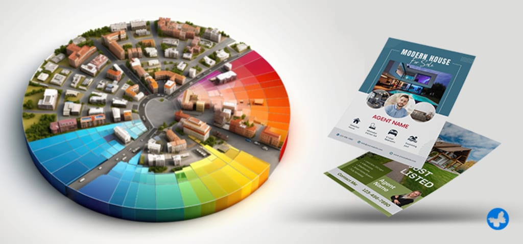
In the competitive world of real estate, first impressions matter. When potential buyers or sellers see your marketing materials, the colour scheme plays a critical role in how they perceive your brand. Colours have psychological effects that can influence emotions, trust, and decision-making. That’s why choosing the right colours for real estate printing is essential to create a lasting impact.
In this article, we’ll explore the science behind colours, how they affect real estate marketing, and which colours work best for business cards, flyers, signage, and other real estate printing materials.
Why Colours Matter in Real Estate Printing?
Colour psychology is widely used in branding and marketing because different colours trigger different emotions and perceptions. In real estate, where trust, professionalism, and urgency are key, the right colour choices can:
✔ Attract More Attention – Certain colours stand out more than others, making your materials noticeable.
✔ Create Emotional Connections – Colours evoke emotions that can influence buyers and sellers.
✔ Enhance Brand Recognition – Consistent colour use across all real estate print materials strengthens your branding.
✔ Drive Action – The right colours can encourage people to call, visit your website, or attend an open house.
Let’s explore the best colours for real estate printing and how they impact marketing effectiveness.
Best Colours for Real Estate Print Marketing & Their Impact
1. Blue – Trust, Stability, and Professionalism
Why it works:
Blue is one of the most popular colours in real estate branding because it represents trust, reliability, and credibility.
Many large real estate companies (e.g., RE/MAX, Zillow, Coldwell Banker) use blue in their logos.
It’s a safe and professional choice for business cards, letterheads, and yard signs.
Best Uses:
✔ Business Cards
✔ Real Estate Signs
✔ Flyers & Brochures
👉 Tip: Darker shades of blue (navy, royal blue) convey authority, while lighter shades (sky blue) feel more approachable.
2. Red – Urgency, Energy, and Excitement
Why it works:
Red creates a sense of urgency and excitement, making it ideal for call-to-action elements.
It’s an attention-grabbing colour that can boost open house flyers, "For Sale" signs, and promotional materials.
However, too much red can be overwhelming, so use it sparingly.
Best Uses:
✔ Open House Flyers
✔ "For Sale" & "Just Sold" Signs
✔ Special Promotions & Discounts
👉 Tip: Pair red with white or black to create contrast and avoid making your design too aggressive.
3. Green – Growth, Wealth, and Sustainability
Why it works:
Green is associated with growth, wealth, and nature, making it a great choice for real estate materials.
It works particularly well for luxury real estate, eco-friendly homes, and properties with large outdoor spaces.
It’s also an excellent choice for real estate agents who want to promote sustainability.
Best Uses:
✔ Eco-Friendly Property Flyers
✔ Luxury Real Estate Brochures
✔ "For Rent" Signs
👉 Tip: Use dark green for high-end properties and light green for nature-focused branding.
4. Black – Luxury, Sophistication, and Authority
Why it works:
Black conveys luxury and exclusivity, making it perfect for high-end real estate marketing.
It works well when combined with gold, silver, or white to create an elegant look.
However, too much black can feel uninviting, so balance it with lighter colours.
Best Uses:
✔ Luxury Property Brochures
✔ Business Cards for High-End Agents
✔ Open House Invitations for Exclusive Listings
👉 Tip: Use gold foil or metallic accents on black business cards for a premium feel.
5. Yellow & Orange – Energy, Optimism, and Friendliness
Why they work:
Yellow and orange create warmth and positivity, making them great for family-friendly neighborhoods and first-time homebuyers.
Orange is often used to highlight key information, such as contact details or discounts.
These colours should be used as accents rather than dominant colours in real estate printing.
Best Uses:
✔ "Coming Soon" and "New Listing" Flyers
✔ Call-to-Action Buttons on Digital & Print Ads
✔ Real Estate Postcards
👉 Tip: Use yellow or orange in combination with blue or black for better contrast and readability.
6. White & Neutral Tones – Simplicity, Cleanliness, and Modern Appeal
Why they work:
White represents simplicity, modernity, and professionalism, making it a great background colour for real estate printing.
Neutral tones like beige, gray, and taupe convey sophistication and minimalism.
They work well for brochures, luxury real estate magazines, and corporate branding.
Best Uses:
✔ Real Estate Brochures
✔ Minimalist Business Cards
✔ Luxury Home Marketing Materials
👉 Tip: Use white space effectively to make important details stand out.
How to Choose the Right Colour for Your Real Estate Printing?
When designing real estate marketing materials, consider the following:
🎯 Target Audience:
Luxury buyers? Use black, gold, or deep blue.
First-time homebuyers? Use warm and friendly colours like orange or yellow.
Eco-conscious buyers? Use green and earthy tones.
🏡 Property Type:
Commercial properties? Stick to professional colours like blue, gray, or black.
Family-friendly neighborhoods? Use welcoming colours like yellow and soft blue.
📌 Branding Consistency:
Use the same colour palette across all real estate printing materials, from business cards to yard signs, to create a cohesive brand identity.
Final Thoughts
Choosing the right colours for real estate printing is more than just about aesthetics—it’s about psychology, branding, and marketing impact. The right combination of colours can attract more clients, increase trust, and make your marketing materials more effective.
🚀 Need high-quality real estate printing with the perfect colour selection?
Visit AgentPrint.com for custom business cards, real estate signs, brochures, and more—designed to make your listings stand out!
About the Creator
The Path to Salvation
The late autumn evening air filled the monk's lungs, but it wasn't the season that chilled his bones. The heavy-handed presence of evil he had sensed upon entering the woods surrounding this mountain village had not bothered to conceal itself from him.
By Made in DNA7 days ago in Fiction


Comments
There are no comments for this story
Be the first to respond and start the conversation.