
The Parle-G Girl — A Case for the Soul in Design
Every once in a while, a product crosses over from the shelf into our soul. Parle-G is one of those rare entities, a biscuit that is more than a biscuit.

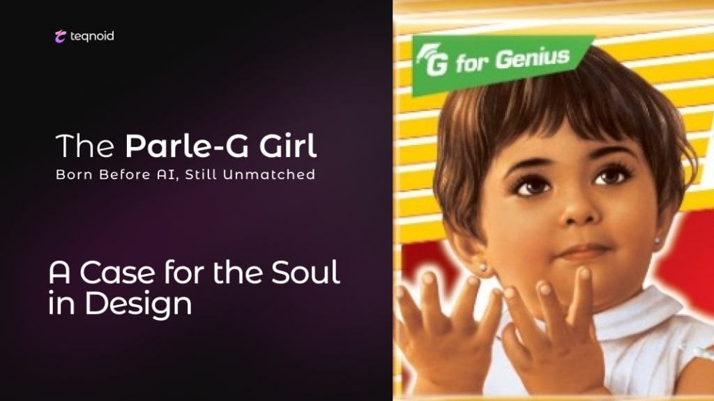
Every once in a while, a product crosses over from the shelf into our soul. Parle-G is one of those rare entities, a biscuit that is more than a biscuit. It’s a memory, a cultural relic, a visual heirloom passed down generations. And at the heart of this nostalgia is not just the taste, but a face. The face of a girl with hopeful eyes and an innocent gaze. She didn’t just sell biscuits, she stood for simplicity, comfort and trust.
Before AI-generated faces became the norm and before branding was dissected into color codes and algorithms, there was the Parle-G girl. She emerged without digital polish, without focus groups, and certainly without the strategic heft that modern branding budgets command. Yet she achieved what most contemporary brands only dream of. She became timeless.
As a logo design agency observing this phenomenon, what we see is not merely a successful brand mascot, but a powerful example of how illustration, typography and intention can align to create something with genuine cultural permanence. The Parle-G identity offers an opportunity to examine the heart behind the brand, and how its visual DNA still thrives today, decades after its creation.
The Birth of a Character, Not Just a Logo
There’s a fascinating misconception about the Parle-G girl , that she was based on a real person. Over the years, many theories floated around. Was it the daughter of the artist? A Bollywood child actor? A real consumer captured in a moment of delight? The truth is, she wasn’t anyone specific. She was designed in the 1960s by artist Maganlal Daiya, who was tasked with creating a visual representation for the brand.
Unlike today’s over-analyzed logo creation processes, her illustration was guided by instinct and purpose. She was drawn to be relatable, trustworthy and sincere. Not “target-audience friendly,” but emotionally resonant in the way only hand-drawn faces can be. She wasn’t named. She wasn’t given a personality document. Yet somehow, she lived. That’s what made the design exceptional.
From a brand perspective, this wasn’t a “logo” in the modern sense. It was a fusion of identity, narrative and emotion. But that’s exactly what logos used to be, and what many still strive to be. Before design became overly filtered through digital templates and trends, there was a soulful focus on character. The Parle-G girl wasn’t just a face to recognize , she was a feeling to remember.
Typography, Color, and the Genius of Restraint
One of the most overlooked elements in the Parle-G brand’s impact is its logo typography. The classic slab serif typeface used in “Parle-G” is straightforward, almost unremarkable at first glance. It’s neither flashy nor aggressive, but it holds its own. Its charm lies in its restraint.
The choice of maroon as the primary color in the logo evokes tradition, comfort, and longevity. It resists trendiness. When brands today obsess over pastel palettes or hyper-modern gradients, Parle-G’s deep red insists on being unfashionable, and that’s exactly why it has remained relevant. It doesn’t chase attention, it commands it through familiarity.
Typography in logos is often treated as a supporting actor, but here, it shares the stage with the girl. There’s a quiet balance between the text and the image , the girl’s eyes draw you in, but the brand name holds you there. It is not trying to entertain. It is trying to be remembered.
This level of intentional simplicity is a hallmark of great design. As designers, we often look for minimalism as a way to reduce clutter. But Parle-G took a different route. It created visual focus not by reducing, but by anchoring. The balance of image and text doesn’t just label the biscuit pack, it builds trust, especially in a diverse country like India where visual literacy often precedes verbal comprehension.
A Design Language That Outlived Eras
Over the decades, design trends have come and gone. We’ve seen waves of skeuomorphism, flat design, neumorphism and now AI-generated branding. But through all of it, the Parle-G girl remained largely untouched. She was only slightly refreshed in the early 2000s, but the soul of the design remained intact.
And here’s the curious thing. Every time Parle tried to modernize the design too much, public resistance pushed it back. People weren’t ready to let go. Because what they saw wasn’t just a biscuit packet. It was a part of their childhood, their train rides, their tea breaks. The design was no longer just functional. It had become emotional infrastructure.
This emotional saturation cannot be achieved through high-end tools or design frameworks alone. It happens when design is allowed to breathe, to exist organically, to gather meaning over time. It’s a quiet reminder that design doesn’t end when the file is exported. It lives on in the way people experience it, associate with it, and carry it with them.
As agency who have provided logo design services to many client with different company such as Japan, South Korea & USA, what we find most compelling is not that the Parle-G logo resisted change, but that it didn’t need to. It had already achieved what most rebrands aim for , authentic, long-term recognition rooted in emotional memory. And that is not easy to manufacture.
What Modern Branding Can Still Learn from the Parle-G Legacy
In an age where AI can generate a hundred logo variations in seconds, what does the Parle-G story really offer us? It reminds us that design is still a deeply human craft. Algorithms can replicate symmetry, layout and color harmony. But they cannot infuse meaning into a stare, or evoke a shared past through a serif font.
Modern branding efforts tend to lean into metrics, what gets the most clicks, what’s the most “shareable,” what works on digital platforms. But Parle-G predates all of that, and still thrives in today’s hyper-digital world. Not because it was optimized for platforms, but because it was optimized for connection.
It’s not that new-age logos are less effective. Many are brilliant. But when you study Parle-G, you begin to question whether our current obsession with modular design and rapid iteration is diluting the emotional depth of our work. The Parle-G girl wasn’t built to convert, she was drawn to care.
And that, perhaps, is the truest benchmark of meaningful design. A logo that doesn’t just communicate, but comforts. A brand identity that doesn’t just promise quality, but evokes warmth. A character that doesn’t just sit on a packet, but grows up with you.
Conclusion
The story of Parle-G is a story about how brands can become something more than brands. It is a story about how design, when done with sincerity and restraint, can transcend market dynamics and evolve into cultural memory.
And as a logo design agency, we don’t just see a biscuit when we see Parle-G. We see a case study in soul-driven design. We see proof that the most enduring logos are not the ones with the most polish, but the ones with the most heart.
The Parle-G girl wasn’t created to follow design trends, she was born to stay. And she did.
If you’re building a brand that aims to outlive trends, speak to hearts, and carry meaning — not just metrics — let’s explore how thoughtful logo design can become your most human asset.
Visit Teqnoid to start that conversation.
About the Creator
Teqnoid
A Global Incubator that helps shape brand strategies, craft powerful websites and campaigns, and drive shared success with thriving startups in Japan, Korea & the USA!


Comments
There are no comments for this story
Be the first to respond and start the conversation.