
How Typography Impacts Infographic Design
And tips on how to leverage it effectively


Typography is a key part of infographic design. It affects readability, visual hierarchy, and how well your message connects with your audience. Here's what you need to know:
- Font Style: Sets the mood and impacts readability (e.g., sans-serif for tech, serif for formal topics).
- Size Hierarchy: Guides readers through the content using varying font sizes.
- Spacing and Layout: Adds clarity and balance to the design.
- Color Contrast: Highlights key points and improves text visibility.
Quick Tips:
- Use no more than three fonts for consistency.
- Match fonts to your infographic's theme (e.g., playful for kids, clean for corporate).
- Prioritize readability with proper font size, spacing, and contrast.
- Test your typography with a sample audience to ensure clarity.
AI tools like "Text to Infographic" can help automate font selection, layout optimization, and brand integration, making professional designs easier to achieve. Good typography ensures your infographic is clear, visually appealing, and easy to navigate.
Principles for Typography in Infographics
Typography plays a major role in how an infographic communicates its message. Here are some essential principles to help you make the right choices.
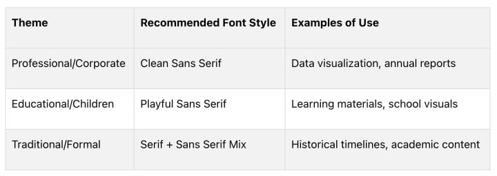
Matching Fonts to Your Infographic's Theme
Fonts set the tone for your infographic. They can evoke emotions and shape how your message is received. For instance, sans serif fonts often work well for tech-related topics, while a mix of serif and sans serif fonts can add a polished feel to subjects like business or culinary arts [1]
Keeping Typography Consistent
Consistency in font use ensures your infographic looks polished and is easy to follow. When choosing fonts, follow these tips:
- Stick to one font family for headlines.
- Use a complementary font for body text.
- Add a third accent font for highlighting key points or callouts.
Prioritizing Readability
Above all, your text needs to be easy to read, especially when presenting detailed or technical information [3]. Here’s how to keep it clear:
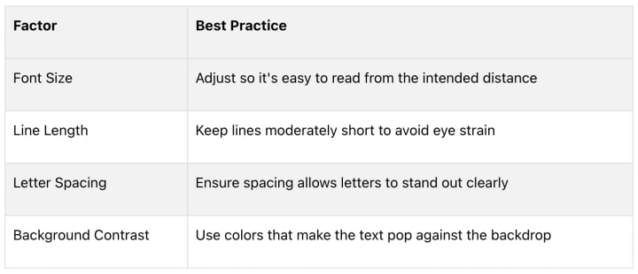
Choose fonts with clear, distinct letterforms, and avoid overly decorative or script fonts for body text. This is especially important for infographics with numbers, statistics, or technical details, where clarity is key [2]. Testing your typography with a sample audience can confirm that it’s effective and easy to understand [5].
Typography Best Practices for Infographics
Good typography can make or break an infographic. By following these guidelines, you’ll create designs that are easy to read and visually engaging.
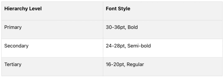
Establishing a Visual Hierarchy
Visual hierarchy helps readers navigate your infographic effortlessly. Here's how to use fonts effectively:
Using Color and Contrast
The right color and contrast choices can make your text stand out without straining the eyes. Keep these tips in mind:
- Opt for dark text on light backgrounds for better readability.
- Use colored text sparingly, mainly for headlines or to highlight key points.
- Check that your color combinations provide enough contrast for clarity.
Organizing Text Layout
How you arrange text matters just as much as what you say. Use these strategies to keep your infographic clean and easy to follow:
- Break text into smaller, manageable sections.
- Align text with accompanying visuals for a cohesive look.
- Utilize white space to avoid overcrowding and make the design feel open.
"Using lines of 50-75 characters can improve readability and reduce eye strain"
These tips form a solid base for typography in infographics. For even better results, consider using AI tools to refine your designs.
Using AI Tools for Typography in Infographic Design
Mastering typography is key to creating great infographics, but AI tools can make the process faster and easier for everyone, whether you're just starting out or have years of experience. These tools use machine learning to apply design principles, helping you craft infographics that are both visually appealing and easy to read.
Text to Infographic: An AI Infographic Design Tool
The Text to Infographic tool simplifies typography by automatically applying design rules to create well-balanced infographics. Here’s how it works:
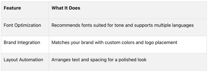
This tool is especially helpful for global teams, as it keeps typography consistent across multiple languages
How AI Improves Typography Design
AI tools change the game by automating tedious tasks, saving time, and ensuring your designs look polished - even if you're not a typography expert. They handle font selection, check text contrast, and adjust layouts automatically, making professional results more accessible.
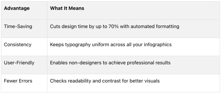
These tools analyze your content and suggest typography combinations that improve the flow of information. Use their suggestions as a starting point, then tweak the details to align with your brand and specific goals.
"AI tools should support human creativity and judgment in typography design. They serve as valuable resources for simplifying the design process while maintaining professional standards."
Conclusion: Typography's Role in Infographic Design
Typography plays a key role in infographic design, influencing how people interpret and interact with the content. It helps establish a visual hierarchy and improves readability, making it easier for audiences to navigate complex information.
"Typography is the art of arranging text to enhance readability and create visual hierarchy"
[6]
While the basics of typography remain crucial, modern tools make applying these principles much easier. AI-driven platforms like Text to Infographic simplify tasks such as choosing fonts, optimizing layouts, and maintaining design consistency.
Whether you're using sleek sans-serif fonts for tech-related topics or classic serif fonts for more formal themes, good typography boosts both clarity and visual appeal [1][4]. Combining timeless typography rules with AI-powered tools brings professional-level design within reach for everyone.
FAQs
What typography is best for infographics?
Choosing the right typography for infographics is all about balancing readability, tone, and your audience's preferences. Sans-serif fonts like Roboto and Helvetica are popular for headers because they’re clean and easy to read on screens, while serif fonts are better suited for body text [1][4].

Display fonts should only be used sparingly for accents or short highlights, as overusing them can hurt readability [1]
Here are some tips to guide your typography choices:
- Match the theme: Pick fonts that fit the mood and purpose of your infographic
- Use size wisely: Font sizes should create a clear hierarchy while staying easy to read.
- Think about context: Consider where and how your audience will view the infographic - on a screen, in print, or from a distance.
Studies show that well-chosen typography can improve understanding by up to 50%, which makes it a key part of infographic design. Stick to fonts that prioritize clarity over style to make sure your message comes through loud and clear.
About the Creator
Keep reading
More stories from writers in 01 and other communities.
Understanding Flexible Packaging Bags and Films in Modern Manufacturing
Flexible packaging bags and films have become an essential part of modern packaging systems worldwide. Used across industries such as food, pharmaceuticals, agriculture, and personal care, flexible packaging supports efficient product handling while adapting to diverse functional needs. Unlike rigid formats, flexible packaging is characterized by its ability to change shape, offering practicality in storage, transport, and use.
By charliesamuel7 days ago in 01
Seattle Nightlife Report: Pony
Mid-winter Friday night. Early but already so dark. The days are getting longer but 6 PM is still pitch black. “Firepit!” You declare things after just a few seconds of solemn thought – not a request or suggestion, not a demand. Last week you walked around saying, “Hot tub?” to anyone who would listen. Or one afternoon you pointed at two men holding hands as they crossed 12th Avenue, looked me in the eyes and said, “Boyfriends.”
By Joe Nasta | Seattle foodie poet7 days ago in Wander


Comments
There are no comments for this story
Be the first to respond and start the conversation.