
Fintech Web Design Is Not About Looking Good
Find out why fintech web design goes far beyond aesthetics—and how UX decisions shape trust, compliance, and long-term product growth.

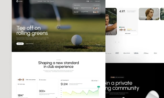
If you’ve ever built a fintech product, you know the website is not just marketing. It’s the first part of the product. That’s why teams that treat fintech sites like generic landing pages eventually end up rebuilding them. The constraints are different, the stakes are higher, and the expectations are less forgiving. You don’t design fintech like a portfolio site. You design it like infrastructure. That’s the mindset behind specialized approaches to fintech web design.
Trust Is the Primary Feature
Most industries talk about trust as a brand outcome. Fintech treats it as a prerequisite. Users are not browsing. They’re evaluating risk. Before they care about features, they want to know whether the product is safe enough to engage with.
This changes how design works. Small inconsistencies that would go unnoticed elsewhere suddenly matter. Copy precision, spacing discipline, and predictable flows become credibility signals. A confusing form is not just bad UX — it’s a red flag. An unclear loading state feels like instability. A vague label introduces doubt.
In fintech, trust is rarely built through claims. It’s built through behavior. Calm interfaces, clear intent, and consistent interaction patterns do more than badges and slogans ever will.
UX Patterns That Quietly Build Confidence
The strongest fintech products don’t rely on visual tricks. They rely on repeatable interaction patterns that reduce uncertainty.
Clear action language is one. Buttons that describe outcomes (“Verify identity,” “Connect account”) remove ambiguity. Users are more comfortable when they understand what will happen next.
Minimal structure is another. Financial interfaces benefit from visual restraint. Not because minimalism is fashionable, but because cognitive load erodes confidence. A focused screen feels safer than a dense one.
Transparency around system states matters even more. When money is involved, silence feels dangerous. Showing progress, pending states, and transaction context prevents users from imagining the worst. Many trust problems are really visibility problems.
None of this is flashy. That’s the point. Trust grows in the absence of friction, not the presence of decoration.
Compliance Is Part of the Experience
One of the biggest misconceptions in fintech design is treating regulation as an external constraint. In reality, compliance defines the interface from the start. KYC flows, disclosures, and consent mechanisms aren’t add-ons. They are core product interactions.
The difference between weak and strong fintech UX is how these requirements are integrated. Poor products bolt legal steps onto otherwise clean flows. The result is fragmented experiences: pop-ups, awkward detours, and walls of text that feel detached from user intent.
Better products design compliance structurally. Legal context appears where decisions are made. Status visibility reduces anxiety during verification. Language is rewritten for screens, not copied from documents.
When done well, regulation stops feeling like friction and starts feeling like seriousness. That shift is subtle, but it changes how users interpret the entire product.
Conversion and Retention Are UX Problems
Fintech metrics often expose design flaws faster than other industries. Abandoned onboarding, incomplete verification, and support tickets about “missing” money are usually not marketing failures. They are experience failures.
Financial actions amplify hesitation. Every additional step introduces risk perception. That’s why clarity and responsiveness have outsized impact on conversion. Users don’t drop off because they’re bored. They drop off because something feels unclear or unstable.
Retention follows the same logic. People stay with fintech tools that feel dependable. Not exciting. Dependable. Interfaces that explain themselves reduce the need for second-guessing. Over time, that predictability builds habit.
Trust compounds when users stop evaluating the product and start relying on it.
Innovation Without Breaking Confidence
Fintech teams often get trapped between two extremes. Move fast and risk compliance debt, or move cautiously and lose relevance. The more durable path is designing systems that absorb change.
Stable foundations — onboarding logic, consent models, information hierarchy — give teams room to evolve on top. When core patterns remain consistent, features can grow without resetting user trust. The interface evolves, but the mental model stays intact.
This is where experience with complex digital products becomes valuable. Teams used to building SaaS platforms or enterprise tools tend to think in systems, not pages. That systems thinking translates well into regulated environments where continuity matters more than novelty.
It’s also why fintech sites increasingly resemble product surfaces rather than marketing artifacts, especially in B2B contexts where credibility and clarity matter as much as aesthetics. The overlap between fintech and B2B web design is not accidental — both operate in high-trust, high-stakes domains.
Fintech Design as Product Infrastructure
The most important shift is conceptual. Fintech web design is not a branding exercise. It’s part of the product’s operating system. It carries legal weight, emotional weight, and business weight at the same time.
Teams that recognize this early build sites that scale with the product. Teams that don’t eventually retrofit trust into structures that were never built for it.
And trust, unlike visual polish, is expensive to retrofit.
In fintech, credibility is not a message. It’s an experience accumulated across hundreds of small decisions. Design is where those decisions become visible — or quietly start working against you.
About the Creator
Keep reading
More stories from Valeriia Shulga and writers in 01 and other communities.
Founder’s Guide to Web Design: What to Control (and What to Delegate)
Most founders don’t set out to manage websites. Yet sooner or later, many of them find themselves approving layouts, rewriting homepage copy, or wondering why a “small change” has taken weeks. This usually happens when the website stops being a simple marketing artifact and turns into real business infrastructure. For companies operating in complex markets, especially those relying on B2B web design strategy, the website is no longer decoration. It is a system that shapes growth, perception, and revenue.
By Valeriia Shulga5 days ago in 01
What You Need to Know About Mobile App Development in Charlotte?
The image of technology innovation once centered on a small group of global cities where venture capital flowed freely and startups competed for attention under constant spotlight. That narrative has begun to change. Today, many successful digital products emerge from regions where innovation grows quietly through industry partnerships, practical problem-solving, and steady ecosystem development rather than headline-driven hype.
By Mike Pichaiabout 8 hours ago in 01
The Role of AI in Fitness App Development in 2026
The fitness industry is undergoing a powerful digital transformation, and in 2026, artificial intelligence (AI) sits at the center of this evolution. Fitness apps are no longer limited to step counters or static workout libraries. Today’s users expect intelligent, adaptive, and highly personalized experiences that align with their health goals, lifestyles, and performance levels. AI has become the driving force behind this shift, redefining how fitness apps are designed, developed, and experienced.
By shane cornerus7 days ago in 01


Comments
There are no comments for this story
Be the first to respond and start the conversation.